Skip to content
Paul Waller - Designer

Paul created beautiful designs from abstract technical concepts, and digital experiences that left customers delighted. He always started with his favourite technology stack - pen and paper - so he could sketch ideas before realisation. From 3D to print, UX to illustration and data visualisations, Paul brought passion and flair to his work. Not to mention a bit of 'cycling chic'.

Remembering Paul

Paul had over 25 years of creative experience in design; delivering user and customer experiences across 3D, print, physical, and digital disciplines. At endjin, Paul enabled customers and the team to visualise abstract concepts. Whether it was UX for websites or apps, compelling dashboards or impactful reports, television props for the Great British Menu, illustrations and animations for promotion and marketing campaigns, or logos and iconography for design systems, Paul was responsible for making concepts look and feel great, in a way our customers can understand.

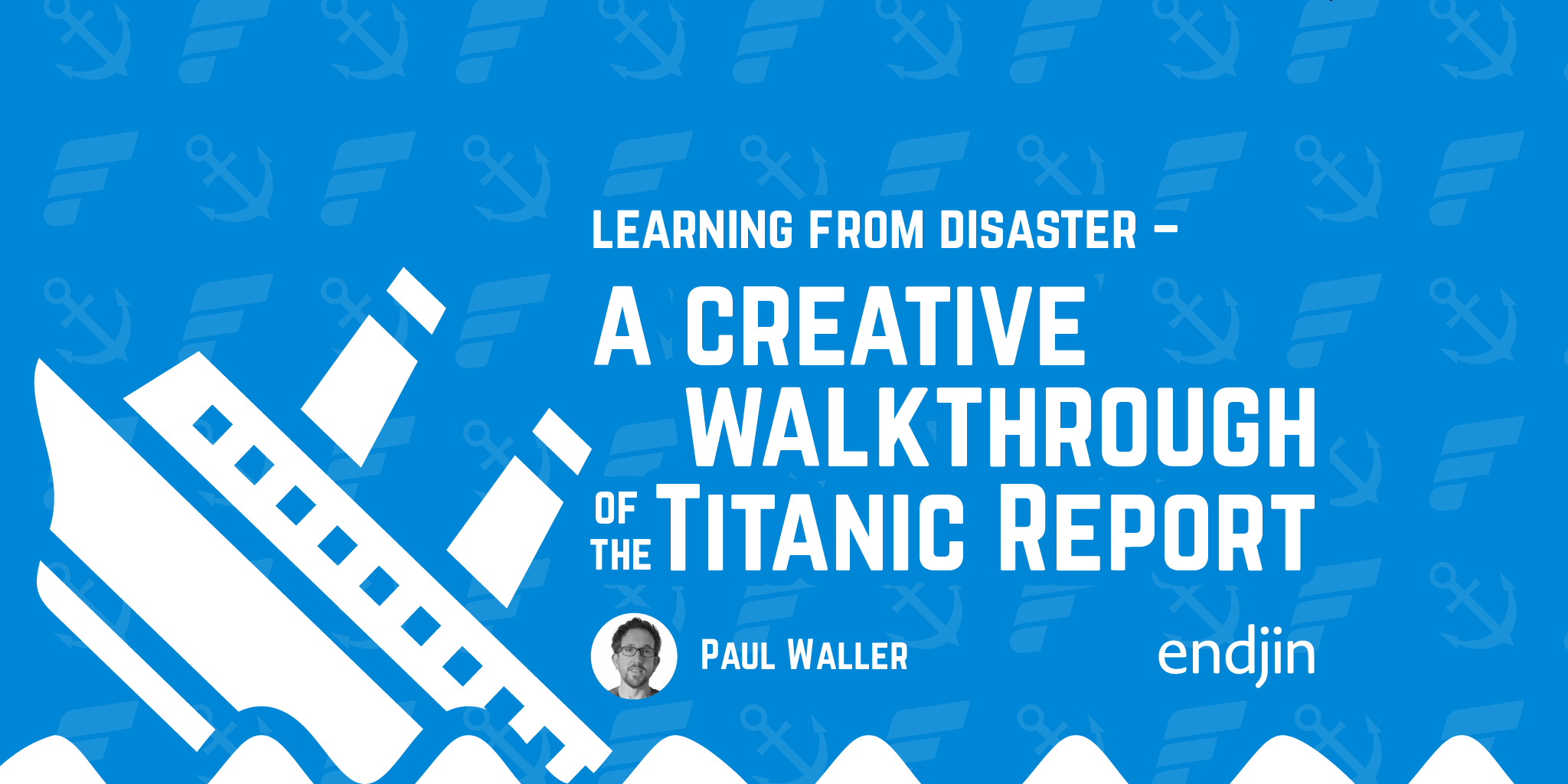
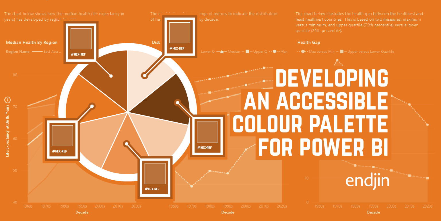
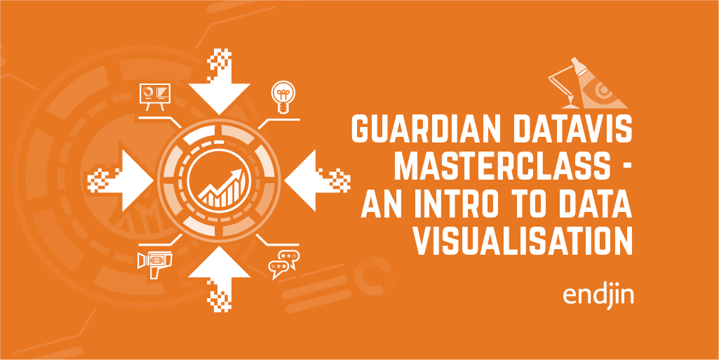
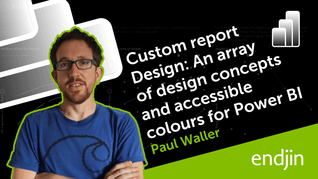
Paul became passionate about accessibility, data visualisation and data storytelling. He collaborated on several Power BI Data Story Gallery examples, including: House Price Analysis - 30 Years, 30 Million Data Points: Unlocking England and Wales Housing Insight, Global Brand Insights: 20 Years of Financial Trends, Learning From Disaster - Titanic Passenger Diagnostics, and Accessible Data Storytelling: World Bank Heath and Wealth Report.

Paul was diagnosed with Motor Neurone Disease in 2024, and passed away in February 2025. He was endjin's first employee and made a huge contribution to the company, our customers, and the wider community. He was the best, and we miss him every day.

how quickly time passes, and you must try to savour every moment, be it at home or, in your professional life. Capitalise on your ambitions, but don't forget your family.

Paul Waller, 30th September 2013

In collaboration with the ElevenLabs Impact Programme and The Scott Morgan Foundation, endjin created a professional voice clone of Paul, using hours of recordings of internal meetings from our archives, and Paul's public videos; we did this in the hope that it would help Paul communicate with his family, friends and colleagues as his condition progressed, but Paul passed away before he could make use of it. To honour his memory, and with the permission of his family, we have used the voice clone to narrate all of his blog posts for posterity.

We hope you enjoy reading and listening to them, as much as Paul enjoyed creating them.

If you found any of Paul's work useful, please consider making a donation to MND Association or The Bikeability Trust in his memory.

View Blogs View Talks
Power BI Images That Pop: A Guide to Intuitive, Easy-to-Maintain Reports

Power BI Images That Pop: A Guide to Intuitive, Easy-to-Maintain Reports

Paul Waller

Explore integrating icons, pictograms and images into Power BI in the optimal way to enhance the user experience and minimise effort required to build and maintain reports.
How to Build Navigation into Power BI

How to Build Navigation into Power BI

Paul Waller

Explore a step-by-step guide on designing a side nav in Power BI, covering form, icons, states, actions, with a view to enhancing report design & UI.
Developing a new JSON Schema Brand and Website

Developing a new JSON Schema Brand and Website

Paul Waller

Discover Paul's guide on expanding brand collateral for organizations through effective website development and design strategies.
Styling and Enhancing Model Driven Apps in Power Apps

Styling and Enhancing Model Driven Apps in Power Apps

Paul Waller

Discover a concise guide on improving Model Driven Power Apps styles with step-by-step instructions for a polished user experience.
How to develop an accessible colour palette for Power BI

How to develop an accessible colour palette for Power BI

Paul Waller

Explore how we developed an accessible color palette for Power BI reports, considering color vision deficiency and data visualization.
How to enable data teams with the design assets required for impactful data storytelling in Power BI

How to enable data teams with the design assets required for impactful data storytelling in Power BI

Paul Waller

In this post we will talk through how to expand on a data team's creative skillset, without access to specialist photo editing software such as Photoshop or Illustrator.
How to Create Custom Buttons in Power BI

How to Create Custom Buttons in Power BI

Paul Waller

Explore a step-by-step guide on designing custom buttons in Power BI, covering shape, form, icons, states, actions, and enhancing report design & UI.
Visualising Technical Content - How we Design our Blog Headers

Visualising Technical Content - How we Design our Blog Headers

Paul Waller

In this post we will be talking about our graphic process from conception to finalisation. We will look at Icons, Pictograms, Ideogram, and how we utilise this form of design to illustrate abstract technical concepts within our blog header graphics.
How to Build a Branded Power BI Report Theme

How to Build a Branded Power BI Report Theme

Paul Waller

Explore translating a company's brand into Power BI reports and extending their visual identity to include the Power BI platform.
Generating custom themes in Power BI – A designer's perspective

Generating custom themes in Power BI – A designer's perspective

Paul Waller

Explore custom Power BI themes and learn tips for styling reports, pushing beyond your comfort zone for enhanced data visualization.
Guardian Masterclass - An introduction to Data Visualisation

Guardian Masterclass - An introduction to Data Visualisation

Paul Waller

A few years ago, I attended a Guardian 1-day Masterclass - Introduction to Data Visualisation. What I did not know then was that it would have a profound effect on how I view design. This blog is a recap of that day and reference points to consider when designing and creating graphics for data visualisation.
Depositing Cheques via a Mobile Banking Experience

Depositing Cheques via a Mobile Banking Experience

Paul Waller

It is possibly that I have only recently discovered one of my favourite pieces of UX whilst on lockdown - Mobile cheques deposits via digital imaging in my banking app. In this short post I share my experience of discovering a simple but practical piece of UX that made me happy.
A Bit of a Christmas Do in the Country with Benchpeg

A Bit of a Christmas Do in the Country with Benchpeg

Paul Waller

In 2016, endjin redesigned the Benchpeg website, migrating it from a 10-year-old platform over to our own CMS system - Vellum – so the Benchpeg team could have greater control over their content management and halve the day-to-day workload for generating content. This is a creative post about the practical experiences gained from 1-day silversmithing workshop at the invitation of Benchpeg.
Bermondsey barber gets a website for Christmas after featuring in Time Out London

Bermondsey barber gets a website for Christmas after featuring in Time Out London

Paul Waller

Journalist Danielle Goldstein interviewed local barber Vangelos Georgiou, who has been cutting hair at George Gents' Hairdresser on Bermondsey street (near endjin's old office) since 1970. In the Time Out London article, Georgiou mentioned that he didn't have a phone or website because of the expense. The team at endjin spotted the article and decided to step in and help - building him a new website to help attract and inform customers.
Reasons to: Round up of the Sessions I Attended

Reasons to: Round up of the Sessions I Attended

Paul Waller

The 3-day "Reasons To" conference was held in Brighton in September 2016. The conference is a fusion of disciplines: design, development, illustration, 3D modelling and data visualisation to name a few. In this post Paul Waller provides an overview of the sessions he attended and the ideas that really sparked his imagination.
Designing for television: food safe props for The Great British Menu 2014

Designing for television: food safe props for The Great British Menu 2014

Paul Waller

Throughout endjin's history we have been invited to work on a host of projects. In late 2013 we were asked if we could produce a series of graphics props for the Great British Menu 2014. In this post we talk about the research and production methods behind developing graphics for television.
High-Res Prototyping Tips: How we eliminated waste and enabled collaboration

High-Res Prototyping Tips: How we eliminated waste and enabled collaboration

Paul Waller

This post discusses the importance of collaboration between designers and developers, including communication tips and a step-by-step guide.
It's more than just merchandise: Developing a visual language

It's more than just merchandise: Developing a visual language

Paul Waller

Laying the foundations to build a brand doesn't happen overnight. At endjin it taken many years to develop our brand look and tone of voice. In this post we talk about developing our visual language so that we can maintain a consistent look and feel across all our collateral.
Live by the sword: A practical approach to our own digital strategy

Live by the sword: A practical approach to our own digital strategy

Paul Waller

7 years ago, feels like a lifetime - for you eldest it is - but this was when endjin took the first steps in refreshing our website promoting our cloud expertise and mobile first responsive design. In this post we talk about our strategic, creative, prototyping and production processes to deliver our website and enforce our brand.