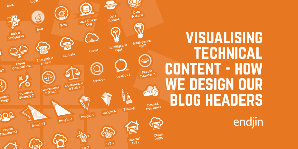
Design assets for impactful data storytelling in Power BI


At endjin, we help small teams achieve big things. A huge part of this is using the power of technology to work smarter, not harder, and a great example of this is empowering teams to create insightful & impactful data stories and data visualizations with Power BI.
Our aim is to be as creative as possible in our report design, displaying a consistent narrative within our data storytelling and making our reports look amazing. Our creative team often use Adobe Photoshop and Adobe Illustrator to edit images and generate custom design assets before importing them as components or backgrounds into Power BI.
But these creative processes and tools pose a challenge to the "Power User" - how can we supply data teams who may not have access to specialist design software with the creative tools and templates to update reports, maintain brand continuity, and develop data stories independently?
Data Storytelling
Before we begin the process of designing templates, we should outline what makes impactful data storytelling. Data storytelling is the ability to effectively communicate insights from a data set using narratives and visualizations. The essence to building a good data story is analyzing data points within a data set to identify meaningful content to extract, and then weave them into a clear, easy to understand narrative.

Developing the ability to elevate insights that may have gone unnoticed is compelling because it enables you to develop a layered or staggered approach to visually representing your data. This helps to create a clear and compelling story, because you realize that not everything needs to be on the first screen. You can stage the flow of your data and build smaller journeys within the overarching data story.
Modern data visualisation tools, such as Power BI, have helped to democratize the process of rapidly developing data stories and visualizing analytics by providing a ready made platform that can be customised without writing a line of code.

Establishing the Right Template Platform
The first step in selecting the right platform for designing creative templates is to establish the creative skill set of the teams you're working with, the packages they have access to, and gaining an understanding of their workflow. Encouraging users to adopt a new platform with a lot of retraining could act as a barrier when learning a new process, so it is important to ascertain a middle ground that is not totally alien to your target users' way of thinking.
We work with a lot of technical teams who may not use creative software regularly or have any creative training. Our primary focus is establishing a platform that everyone uses consistently. Through a series of discussions, we've established PowerPoint as the base for our design templates and coupled this with using SharePoint for our image library. PowerPoint is a highly adaptable tool for setting up image rich presentations, but it can also export images not only as entire presentations but as individual assets.
SharePoint is a readily available platform for document storage and sharing within most organisations, making it an ideal location to set up a creative asset library. Combined with both platforms' ubiquity and the team's exposure to them, makes them a good starting point to develop and host templates.
To maintain continuity across layout and image sizes we started by importing the same Power BI grid into PowerPoint. The size for this is 1280px W x 720px H. PowerPoint will display this at 33.897cm W x 19.05cm H. You can read more about the importance of establishing the foundation grids within report design in my previous post. Grids form the basis for every layout, it's how we maintain consistent spacing between content and eliminate movement across multiple screens.
An example of this would be if we were placing a logo or brandmark and want this to appear in the same location on the next page. We would begin by resizing and aligning the logo to the grid, then using copy/paste to drop it in the same position on the following page. If we wanted the logo to appear in the same location across multiple pages, then we could set up a page as our master and duplicate this throughout our report - a trick that we use when we create multiple layout types.
To give the teams a visual guide in our PowerPoint template for the types of images they are aiming to recreate, we copied over a series of typical layouts and set these up as page masters with image placeholders. Adding the placeholders simplifies the experience of adding an image. It gives the user a clear indication of where they are adding their content and at what size.
They simply click the center of the placeholder to add an image, which is imported and cropped to fill the boundaries of the placeholder. PowerPoint will automatically crop the image to best fill the placeholder. The crop can be edited as we will describe later in this post.
Based on our experience we established two methods for adding images - either as a background for full bleed cover/title pages, or as an individual image which forms part of a combined content layout.
A full bleed image is an image which fills the page or screen showing either continuous colour or image without a border around the edges. This type of image is ideal for a cover or section title page where we want a big impactful image, displaying a high level lead into a topic or subtopic within a report. It's the first touch point of what the user can expect to see as they dive into a particular data story or journey.
When we're adding images as part of a combined content layout with charts, we require our layout to be more fluid and be able to move content inline with our grid. In this situation a background image would confine the layout, so we set up a 2nd template where we could export just an image at a predefined size which we could import, resize, and align within a report. This type of image is more adaptable when working with multiple content types. It also allows users to set up images as button backgrounds and photomontages with actions.
Using PowerPoint and Power BI
Setting up and exporting background images
The first method is set up for full bleed cover and section page images at 1280px W x 720px H. We set up our image placeholders slightly larger by 5-10px around all sides of screen size to allow our content to run off the page. With one-click of the placeholder icon the user can navigate to their image library. They then select and place the image in the placeholder, ready to be edited and adjusted if required within the viewport.
When editing is complete the image is ready to be exported from PowerPoint. It is important that we do not add any brandmarks or logos that are not already part of the image, as we will add all brand collateral as individual assets in Power BI to eliminate any distortion.
To import our cover page within Power BI, we click anywhere on our report canvas, select canvas background from the format pane on the right of our screen, browse to our image folder, select the image, click "Open", the image is imported at 100% of its size, select the dropdown below your image ID and select "Fill". Then the image will resize to the canvas and remove any borders.
Once the image is imported and resized, we check the image transparency is set to 0% so that the image is not transparent and maintains the intended intensity. The image import is complete and ready for text and brandmarks to be layered on top.
Setting up and exporting content images
The second method is slightly different because we only require the image. These images can be any size that conforms to your grid. We set up a range of image sizes from 610px W x 590px H for a large half-page image down to 245px W x 403px H for a small image. We start by importing an image into the placeholder via the same method as explained in the first method.
PowerPoint will automatically apply the best crop, however, we can edit its position within the viewport. Under the "Picture" tab in the "Format Picture" pane we can adjust the image size and Offset X and Y positions within the Crop dropdown.
When the crop editing is complete, right click on the image to ‘Save as a Picture'. This will only save the image highlighted and not the entire screen to your image library. The image is then ready to be imported into Power BI.
To import this image into Power BI we use a slightly different process. We begin by selecting "Insert" from the main menu, Select Image, Browse to your image library, Select the image, and click "Open". If the image imports smaller than 100% of its size, resize in line with the grid as laid out in the template.
The image handles will appear slightly outside the markers, so the trick here is to align the edges of the image not the handles. Fine tuning can be done via the image size and position pane on the right.
Both methods outlined will provide data teams with the capability and independence to add and replace images across their report design and help them to develop impactful engaging data stories whilst maintaining brand continuity.
Conclusion
To aide adoption of new processes, it is important to understand the end user, their requirements, goals and workflow. Defining a middle ground or platform that everyone is familiar with will encourage users to adopt a new process, because the barrier for learning a new skill is reduced.
We've selected PowerPoint and SharePoint to form the basis of our image template and creative asset library because everyone had access and experience in using both platforms, which made it the ideal base to work from. We just had to work out how we could customize our templates to work with Power BI.
Opting to use PowerPoint has expanded on the tools and capabilities that we can provide to data teams we work with. It has enabled endjin to equip and enhance predominantly technical teams, without creative skills and tooling, so they are equipped to creatively edit their reporting independently.
This does not replace the role of the creative team but enables data teams to replace images and pre-designed creative assets to enhance the data story they are conveying whilst also maintaining brand continuity.