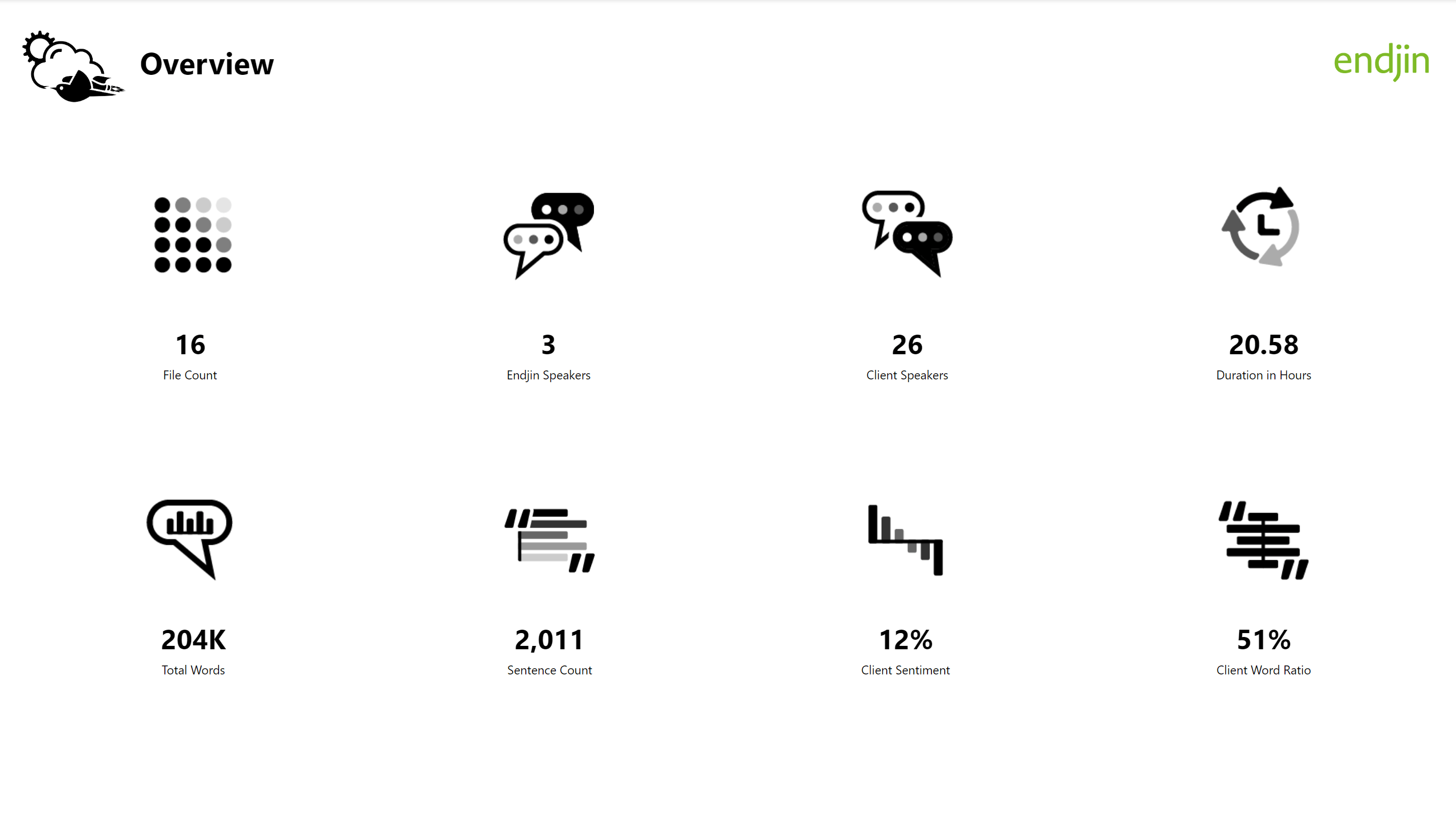
How to Build a Branded Power BI Report Theme


At endjin we have been working with a range of clients to implement modern, cloud based analytics. A critical stage in the lifecycle is the user interface where actionable insights are presented to end users. We find that many projects can fall at this hurdle by failing to present visual components such as charts, tables and icons in a way that engages end users and generate the benefit intended.
To avoid this situation, we advise placing focus onto the branding of your reports as a key activity in any data and analytics project. By projecting the organizations brand, values, and culture in the design of your reports you can achieve much higher levels of engagement from your intended audience. Especially as interactive Power BI data visualizations present a different set of design considerations than static documents like PowerPoint or Word templates, which will likely require updates or additions to existing branding and design guidelines.
We covered some of the styling basics from utilizing the in-app features combined with setting up a custom JSON file in my last post on this topic Generating Custom Power BI reports. Since then, we have been turning our attention to customizing a report to be more attuned with a company's visual identity and accessibility guidelines.
In this first post of the series, we will explore how we begin to translate a brand's visual language into a Power BI report, the limitations, and how adopting a new platform can extend your visual identity to include Power BI reporting. As we progress through the series we will cover the importance of accessibility, particularly for users with Colour Vision Deficiency (CVD), image formats, pop ups, overlays, data visualizations, cross filtering, colour palettes and mobile views.

We'll start by covering custom grids, clear areas, and typography which form the foundations of our brand and help our data pop off the page.
Grid & Composition
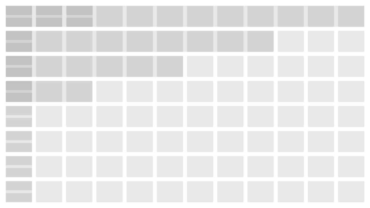
Grids and columns form the foundation of any layout and can be a pivotal part of a company's visual identity by setting the compositional rationale for clear areas and consistent alignment across all channels of branding. Within endjin's brand our desktop grid is based on 12-columns wide with 10px gutters with a 12px border around all edges. We utilize a lot of white space for our borders so that images bleed off the page whilst our border retains our key content so that it's not clipped. This offers both structure and flexibility to our layouts.
So, how do we bring this rationale into Power BI so that our reports start to look and feel part of our brand? Well, it's worth pointing out that Power BI comes with a built-in grid that can be toggled on/off and snap to grid. However, it's not adjustable in terms of grid size, borders, or gutters so your layout and spacing are governed by the default grid. For our template we wanted to maintain a consistent clear area around each chart and avoid a cluttered or overloaded layout.
Our solution was to redraw our grid at the Power BI screen size of 1280px X 720px H to reflect our spacing and clear areas. We use Illustrator, a vector-based package because we want our initial drawing to snap to guides and be sharp when we export the png. To help maintain a clean, sharp image we export our grid oversized at x2. We us this trick so that our images do not interpolate, and they tighten up when they are reduced to size. The image is then imported as a background so that it's not clickable and does not interfere when editing the chart layout. Because we exported our image at x2 it will appear oversized. Selecting 'fill' in the Page Background menu will automatically resize our grid image to the report page and remove any natural borders within Power BI. Now our grid is set in the background we have our guides in place for laying out and aligning our content.
Before adding our content, we reduced the opacity of the grid to knock it back in tone and make it easier to decipher the difference between content and guides. Another trick you can use here is to set your grid to a colour that's not part of your brand colour palette.
Content and Layout
With the foundations in place we begin defining our content areas and composition. Within most or all brand guidelines there will be guidance for layouts indicating placement for logo, title, image, body copy, fonts, and typography usage based on your grid. These elements and areas can only be defined consistently once our grid is in place.
We set aside the top row for our header which includes the high-level brand content incorporating our identity, logo, and page title. We want our logo to be in the same location across the report, so we use the header to set the rationale for this rule. Just as our logo has clear areas the same rule applies to the header. We don't want our content bunching up too close to it, so we set aside the next row down as our clear space acting as a neutral divide between the header and chart content. It's important to add space between these two areas so that visual elements do not overlap with your brand.
In the case of a recent project, we had to consider clear areas on both axis and include more than one item of brand collateral. With the underlying grid we were able to adapt and identify the brand placement whilst maintaining consistent clear areas in accordance with their guidelines.
Next we begin to define on the content area. Our grid gives us a visual framework to the outermost points of alignment, and we can plan where our content should start. As you build your layouts from your data set you can quickly assess how much space is available in terms of conveying the narrative between each screen and the effect of cross filtering. Cross filtering is a key consideration when defining your layout as you interact and drill through your charts all of the page content will adapt to reflect meaningful metrics.
When we have a layout that has been established, we duplicate it as a base layout for the rest of the report. This is handy for consistency as you will want your header to appear in same position throughout your report. It also saves time so that we're not importing the grid every time you start a new page. Whilst we're building our reports, we don't remove the grid, we simply toggle the opacity to view our layout without the grid.
A handy tip - when adding the same content to the same position across your report, much like PowerPoint once you've placed your content you can copy and paste it across multiple pages and Power BI will paste it into the same position, the power of setting your own grid in the concept stage is key to establishing rule for clear areas with your brand.
Less is More
With the grid still in place we will use the 10px gutters as a guide for the clear areas and spacing between each chart. A lateral approach to defining the boundaries is to add a 1px line border around all edges of our chart elements. But what happens as we visualize more data and add more charts? If we're not careful, we can overload the layout and the spacing between each chart will reduce, content will compete for recognition making for a confusing visual experience. So how can we add the appearance of more space and make our layouts easier to read?
It's here we adopt a minimalist approach with the view of 'less is more'. A phrase coined by architect Ludwig Mies van der Rohe and one that has permeated across art, design, and music for the last century. When we are building a report, we are also building a story about the data at its heart. We don't have to add everything on to one page. We need to consider what the data is conveying and how we are representing it as story across multiple pages.
A solution to free up space and avoid a cluttered report is to remove the physical borders around the chart elements altogether and utilize the white space between each chart as your border. By omitting a 1px border we can utilize the negative space between the title and its boundary as well as the area we set aside between each chart. Combining these two areas generates the impression that there is more space than we have. The chart titles have more room to breathe, they don't look squeezed between the borders and the edge chart area or legends. The overall look makes for a lighter, open, and more legible solution.
The benefits of taking the minimalist approach when branding your Power BI theme increases legibility and helps to reduce the visual load on the viewer in terms of their attention across each screen. A physical 1px border can begin to look pinched when more content is added and the space between each chart is reduced. We've noted that there is a tendency to add more content and overload a layout rather than split the data story across more screens. This might not always suit the narrative but if we pare the data back to the necessary elements our visual components will create the impression of simplicity.
A handy tip - defining your data narrative will help balance the amount of content and cross-filtering across your layout.
Fonts & typography
We discussed in a previous posts about translating brand fonts into Power BI and its limitations around publishing and font licenses. So, why not make it a conscious decision to adopt one of the Microsoft fonts available to be part of your brand when building your reports?
But why can't we use our brand fonts? Well the answer is you can, however, there are caveats when you publish the report. The same fonts would need to be installed on the computer of the person/people viewing it. If the viewer does not have the same custom font installed, then Power BI will revert to the default font. This could compromise the typography across your report. Titles can overflow to two lines; card data labels will end in ellipsis because the substitute font cut requires more space. For example, Arial will take up more space than Calibri or Times so it's important to consider fonts and sizes when transferring a brand into Power BI.
When handling typography you want control over the flow, size, and layout. This decision needs to be considered from the outset which is why we carefully select a substitute font. This is the point where you can make the decision to design additions to your visual language if you haven't already. By considering one of the Power BI default fonts, gives you greater control as a designer over the typography.
When selecting fonts, we tend to select a font with a personality that does not collide with our primary font. What do we mean by this is? We source a font that is not too similar to our brand as each font has its own personality which could be too close to our primary font but not convey the same meaning.
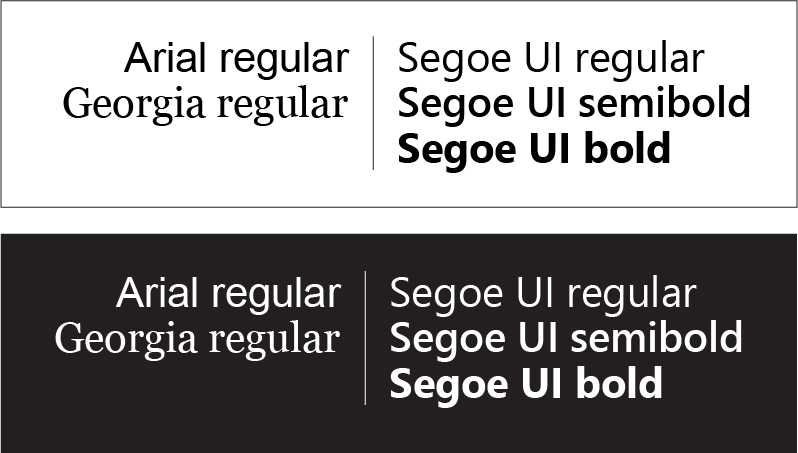
In a recent project we discussed whether Segoe had too much personality compared to Arial, however, because of the depth of font cuts for Segoe it offered greater control over emphasis within the report, so it became the preferred font. This an example of compromises and considerations where a font might not be exactly what you want but it provides the function required. So, we look for a typeface that complements our brand and does not detract from our visual language by being out of character in terms of cut and style.
When it comes to considering fonts for our reports, we've have grown a healthy respect for solid, clean, sans serif fonts like 'Arial', which maintains clarity from 8px up. We've found that Segoe UI and its variety of cuts from regular, semi-bold, and bold provides visual depth if you're looking for distinction and emphasis through weights. Serif faces like Georgia pro-up and down without losing clarity of the serif as it was designed to work at small point sizes and on low resolution. Power BI has made us re-evaluate our font choices in a renewed light for their simplicity, modernity, and function.
Setting up a Cover page
The Cover page is generally the last and one of the more creative pages to be completed as they include a strong contextual graphic inspired by the report in the house style. When it comes to designing a cover page graphic we use 'Photoshop' or 'Illustrator' however, any other graphic package that you prefer to work in will do.
We use the same grid template in the background of our design file so that we can position contextual graphics and develop our design. We will often set up the branding and typography in Power BI first so that we have an indication of clear areas and omit overlaps to increase clarity of of our title content. We do not add branding to a contextual or background image as it can get skewed or distorted when we click ‘Fill'. We always import and align our brand and logotypes as an independent item of collateral to avoid any distortion.
Once we have designed our contextual image, we export the finished graphic at x2 to omit any blur and maintain a crisp, sharp image as described earlier. We're now ready to combine the two design elements. First, we will need to remove our grid background then we can add our contextual graphic as a background image, click 'Fill' to omit any whitespace around the edges to give the appearance of a full-bleed image.

Final Thoughts
When we started setting up our branded theme it's often quite difficult to know where to begin so having base guidelines in place provides a starting point to transfer your brand over to Power BI. As you develop your Power BI theme you can transfer the design rationale back into your brand guidelines so that they inform each other.
You may not have a redefined layout style which could mean redefining an adapted style in your guidelines based on a grid and column that can be adopted across your collateral. Defining your grid sets the foundations to the body of your report whilst also providing guidance over clear areas and spacing of your content.
Don't see limitations as blockers to obtaining a consistent look and feel across your branded reports. Adopt them and build them into your brand to reduce the headache of hacks and compatibility. This is particularly true with fonts.
Finally, including Power BI to be part of your analytics toolkit for out-of-the-box data visualization can really lift the narrative, promote meaningful data solutions, engage your audience as well as extend your brand language, and visual identity into a new platform.
Here are 10 top tips for branding your reports
- Adapt your existing grid to Power BI for consistency across all branded channels.
- Spend time on your first layout as you can duplicate it as a base for all subsequent pages in the report.
- When exporting your images as PNG export them at 2X so that they tighten up when reduced in Power BI.
- Use copy and paste to place brand elements in the same locations across multiple pages for consistency.
- Keep your grid image in the background and toggle the transparency on or off when proofing your designs.
- Remove 1px borders where applicable to generate the appearance of more space.
- Less is more when composing your screens. Consider how cross-filtering will highlight values across your charts.
- Consider adopting one of the default fonts to be part of your brand for greater typographic control.
- Maintain consistent spacing and brand representation.
- Embrace the limitations.