How to develop an accessible colour palette for Power BI


If the audience for your Power BI report is larger than 12 people, then statistically 1 of your audience suffers from Colour Vision Deficiency (Colour Blindness.)
Across a number of client engagements we have explored how we can use Power BI to extend company's brand language. In a previous post we covered how to implement brand guidelines in to Power BI and how embracing the default features can have a positive effect on extending a company's branded collateral.
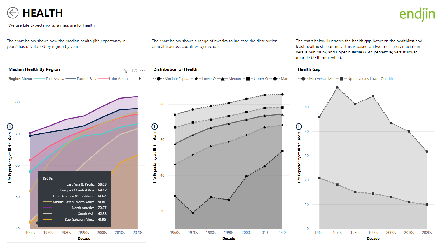
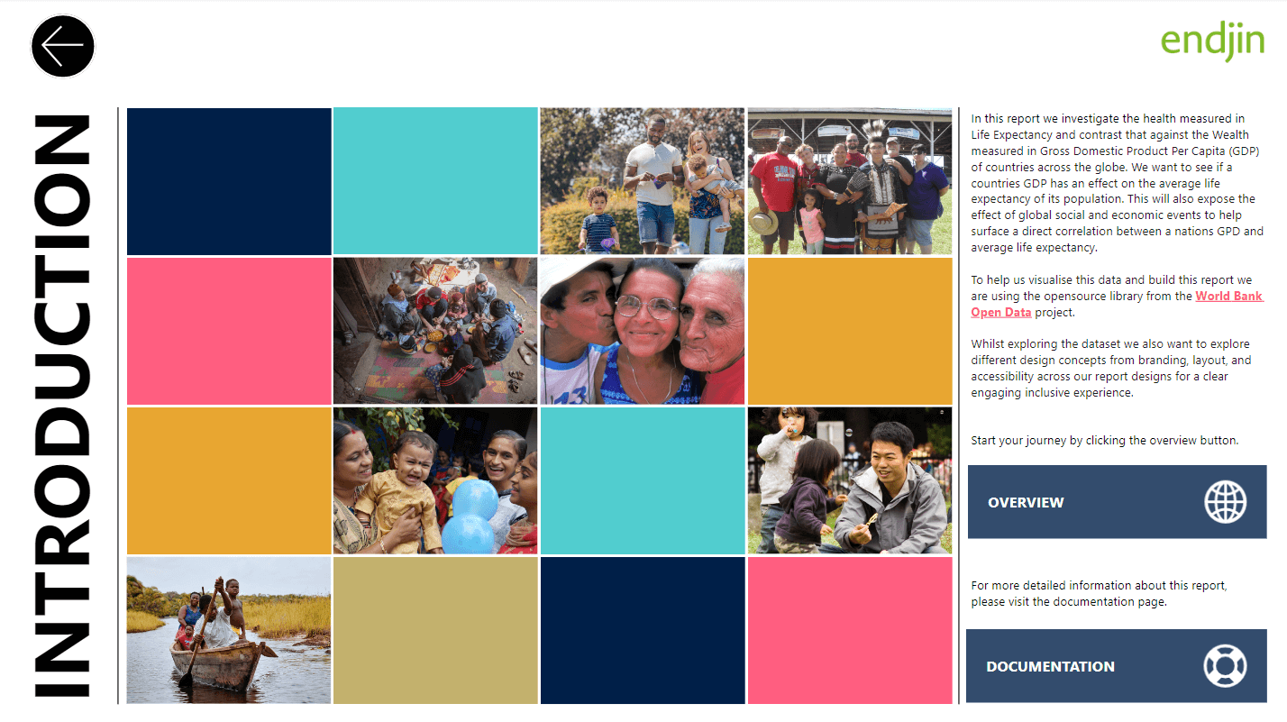
In this post we will focus on the importance of colour within data visualization, the process of designing an accessible colourway, and why choosing colours must be carefully considered for Power BI reporting. To help us visualize this we will be using a custom World Health and Wealth Power BI report we have designed to determine whether a country's GDP influences the average Life Expectancy of its population. This data set utilizes Open Source data provided by the World Bank Open Data project.
Colour within report design
So, why is the use of colour important within report design? We use colour to define contexts and statuses between metrics within our data stories. Accessibility plays an important role in terms of setting the right contrast ratio against W3C standard for vision impairment. To enhance content recognition we will also apply dotted lines and shaped markers to help distinguish data content in place of iconography and texture.

Colour Vision Deficiency (CVD)
A primary consideration when we are developing a colourway is accessibility for users who experience any form of Colour Vision Deficiency (CVD) or colour blindness. CVD affects approximately 1 in 12 men (8%) and 1 in 200 (0.5%) women globally. In the UK there are approximately 3 million colour blind people (about 4.5% of the entire population), most of whom are male. Globally, there are estimated to be about 300 million people with colour blindness. Source: https://www.colourblindawareness.org/colour-blindness/
Types of colour vision deficiency
There are 2 causes of colour vision deficiency, the first type is genetic (hereditary) where the condition is passed down from the parents. The red/green gene is carried by the mother and passed on to their children via the X (sex) chromosome. Women can inherit the colour blind gene from their father meaning they will either have the condition or be a carrier and not experience colour blindness. If both the father and mother have CVD then there is a high probability that their children will inherit the condition. Because of the nature of genetics some people are more disposed to condition than others. The second type of Acquired Vision Deficiency. This is when someone born without CVD can become colour blind via an illness, an accident, medication, or old age where physical changes occur and colour vision declines.
So how can our sight be affected by CVD? The inside surface of the eye is made up of light receptors known as rods and cones, the rods capture lower light level whilst the cones capture higher light levels and colour. There are 3 types of cone cells to capture red light, green light, and blue light. If one of the cone types does not function correctly then this will incur a form of colour vision deficiency. We look at the different types starting with:
- Trichromacy is normal vision where all 3 cone types are functioning correctly. People with normal vision are referred to as trichromats.
- Anomalous Trichromacy where one of the light receptors is slightly misaligned. People with this condition are known as anomalous trichromats and less than 0.01% are affected by this. They can still perceive colour however, with different severities of:
- Protanomaly, which is a reduced sensitivity to red light
- Deuteranomaly which is a reduced sensitivity to green light (the most common form of colour blindness)
- Tritanomaly which is a reduced sensitivity to blue light (extremely rare).
- Dichromacy is when one of the cone cells does not function properly leaving two of the cone cells to receive colour:
- Deuteranopia Red-green (green weak) people are unable to perceive green light. This is the most common form of colour blindness which effects 6% of individuals.
- Protanopia Red-green (red weak) people are unable to perceive red light and effects 2% of individuals.
- Tritanopia Blue-yellow (blue weak) are unable to perceive blue light. This type of vision deficiency is not as common the first two conditions.
- Monochromacy (Achromatopsia) is extremely rare where none of the cone cells function at all, equalling total colour blindness. People with this condition will see everything as black and white or greyscale which can make life very difficult and why tonal range is so important.
- Approximately 1 in 33,000 people will have Tritanopia or Monochromacy.
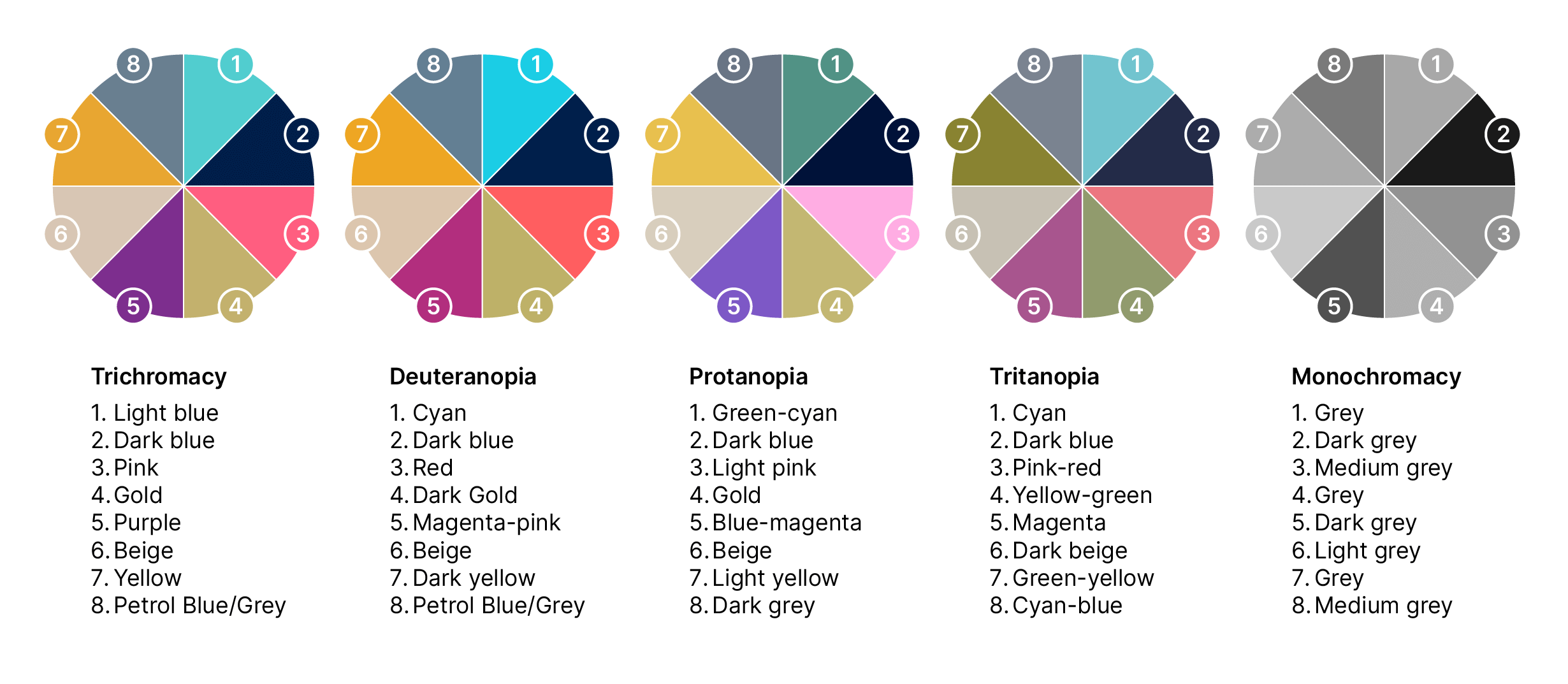
It's because of these different vision types that we aim to design an experience where everyone can derive the same understanding of the data by designing an inclusive colour palette.
Developing an accessible colour palette.
Origin of our palette.
We begin to develop our palette to convey a companies brand with the primary and secondary colourways sourced from their guidelines. However, we find it's not a simple process to lifting colour references from the guidelines into a report. Often there are restrictions on the use of the primary palette which can be restricted to the logo and logotype or there may not be enough tonal depth so, we need to consider a complimentary suite of colours.
In tandem with accessibility within our design process we also consider the aesthetics and the order in which we lay our colours down. So, what do we mean by this? Well, in terms of aesthetics our aim is to make a contrasting and appealing palette to all users with or without CVD. When we're designing assets and graphic systems, we're designing an inclusive experience for all.
Order of colour.
In terms of the order of colour we spend a lot of time researching to optimal placement to lay our colours down. We start with the primary brand palette, add the Hex refs to JSON file then load this into our report. This gives us a very quick baseline to see what works and what doesn't. We will split reds and greens up if they are present by placing them either opposite ends of the palette or with a couple of colours separating them. Whichever works best.
Testing and simulation.
While we're checking our baseline colours we also run a colour filter tool in Win11 settings to simulate our palettes performance for users with Deuteranopia, Protanopia, Tritanopia, and Monochromactic vision deficiencies. By checking the colours across these filters we can see whether they are blending in to one another and there is enough tonal range in the palette. Quite often there isn't so, we begin working in secondary colours and a layer of abstraction.
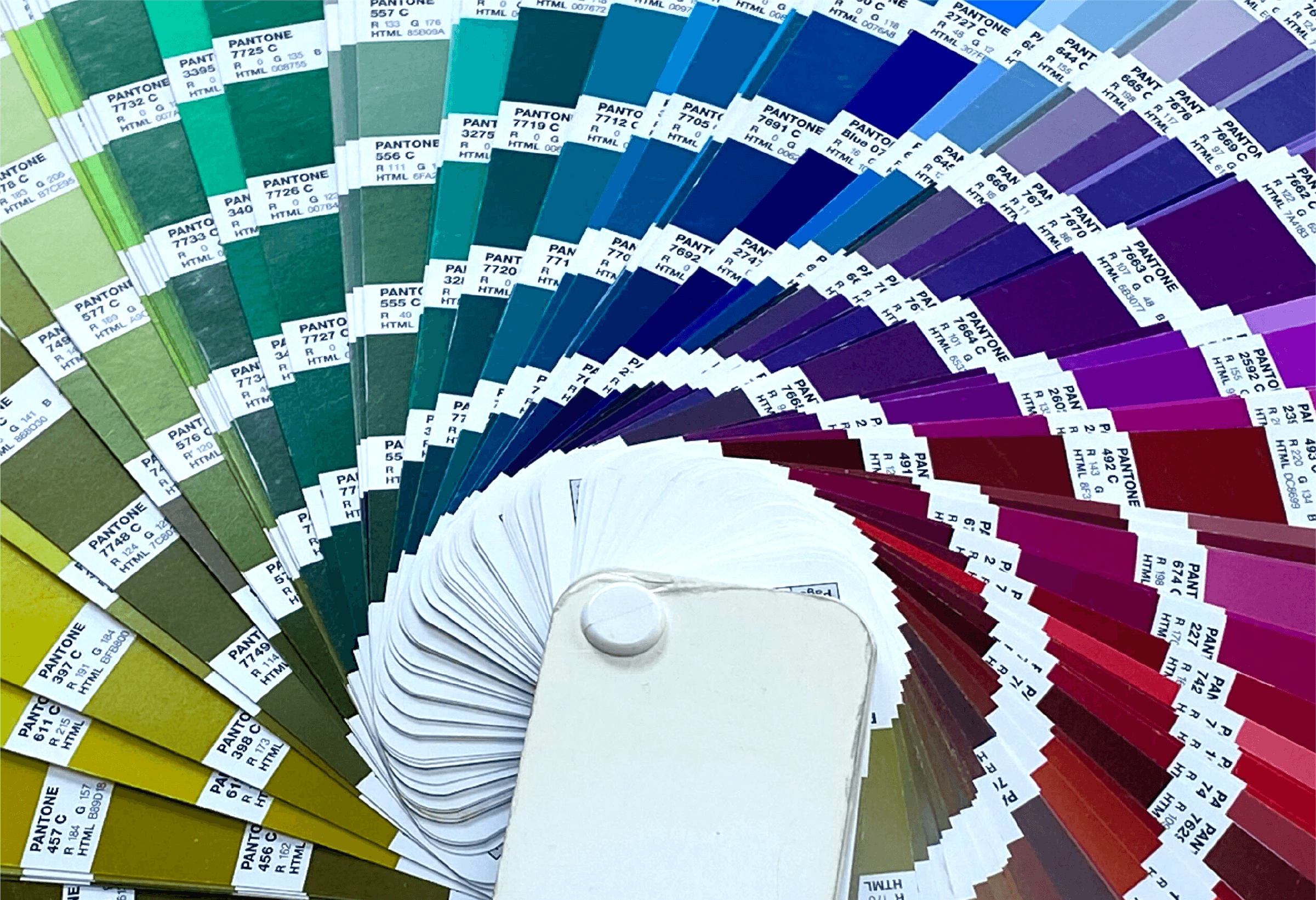
Abstraction and expansion of the palette.
We begin abstracting the colours by going up and down the tonal ranges of the primary and secondary palettes (+or-) the primary hex value. If the tonal ranges are too close, we then introduce colours from the secondary or extended colour palettes. After that we experiment with extending the visual language by introducing complimentary colours to the brand palette. We found Adobe Colour (formerly ColorKuler) helpful for quick colour matching and testing. The only caveat with this is that its only good for digital so this is where our Pantone swatches come in play. Pantone colour swatches really help to ground your colour palette to something that can be useful across multiple mediums. Because we're working with brand guidelines we use this as a datum. With each addition to the colour palette we run it through the colour filter simulator in our report. This is a constant process of iteration and checking until you get to a point where balance of colour ascetically compliments the brand, and there is tonal differentiation between the colours across all filters in our Power BI report.
Fine tuning to the palette.
The colour order is important because Power BI will lay the colours down in the same order as the JSON file - as you would expect but there are instances where the data will overlap the colours. By constantly testing the colours contrast in the report we can finely tune the palette order against graphs, charts for better visibility. We can see whether we have colours blending into one another across the filter simulations. Often, developing the colour palette is one part of the creative process of branding a Power BI report so, we do this against a mock-up report. This helps to free up the creative process whilst allowing the data team to progress the data model before we add the palette to a live report for approval.
Final thoughts
In this post we have explored and developed an accessible aesthetically pleasing colour palette for all. It's by no means the final answer, merely another solution. Colour can be a personal experience and its the absence of difference that we have been investigating. When we think about accessibility, we tend to focus on the deficiencies but we should also think about total inclusivity. Building accessibility parameters early to your workflow makes for a more cohesive design by constantly checking your work against simulators - It's an iterative process that takes time to develop. Whilst we have focused on the colour and tone we are also mindful that this is not the only way to differentiate data metrics. Utilizing dotted lines and markers within Power BI will help to consistently distinguish content.
The HEX ref and PMS matches that we developed in our endjin colour palette are:
- ∎ Green/Light blue "#51CDCF", PMS 3255c
- ∎ Dark blue "#001F48", PMS 281c
- ∎ Pink/Red "#FF5E80", PMS 191c
- ∎ Gold "#C3B16D", PMS 611c
- ∎ Purple "#7D2E8E", PMS 2612c
- ∎ Beige "#D8C6B4", PMS 7501c
- ∎ Petrol Blue "#E8A631", PMS 5405c
Here are some of the tools that we have found useful for simulating and checking colour contrast and tonal ranges for accessibility. However, please note, no simulator is 100% accurate for each type or severity of condition; these are merely a guide:
We hope this provides an insight into how people with Colour Vision Deficiency experience colour.