Guardian Masterclass - An introduction to Data Visualisation
A few years ago, I attended a Guardian 1-day Masterclass - Introduction to Data Visualisation. What I did not know then was that it would have a profound effect on how I view design. This blog is a recap of that day and reference points to consider when designing and creating a data visualisation. During the course we touched on all aspects of the topic from inception and generating ideas, researching, and quantifying data, looking for a narrative, visualisation methods to tooling and highly finished examples.
The day was well organised and from memory the food and snacks were tasty. On arrival you were greeted with complimentary coffee, teas and pastries followed shortly by the call and ushering into the lecture theatre for the first session.
Session One
Adam Frost and Tobias Sturt from Add Two Digital agency
The session began with a red screen, a discussion on colour and how this can affect a viewer's emotions and reaction to a topic. How the combination of images, text, and colour in juxtaposition are the foundations of storytelling and Data Visualisation is a form of digital story telling where you are visually enhancing a topic whilst also being truthful to the data. The process of selecting a colour, layering of images can enhance and aide viewer's interpretation of a story. Although graphic stories are not just put together, there is a defined order of generation which is summarised in the 4 stages of Data, Story, Chart and Design:
- Data – the data should be credible and comprehensible. Look for patterns and trends in the data, which will enable interactivity. If the data is inconsistent or incomplete – stop. Do not continue.
- Story – the story should resonate with your target audience. Look for narratives that will help to convey the data in the best light.
- Chart – Analysts, Researchers and Designers come together and begin to shape and form the data with tools like Excel, Word, Balsamiq and begin to excavate the data to the beginning of its visual form.
- Design – The last stage which gets the most coverage and competition. The design based on the data surfaced must be compelling and look appealing.
Edward Tufte v David McCandless
Next up we looked at a comparison between two well-known figures and their approaches to data visualisations Edward Tufte and David McCandless.
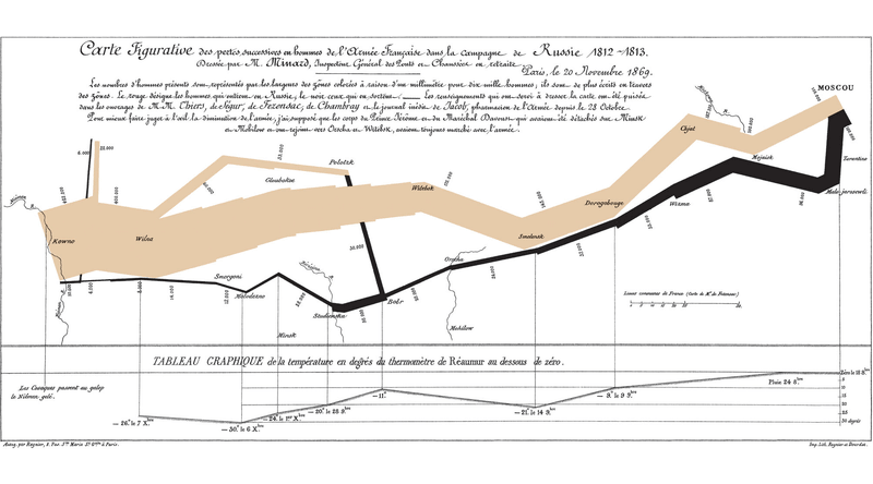 Charles Joseph Minard's Figurative Map depicting Napoloen's Russian campaign of 1812.
Statistician, Artist, and pioneer of data visualisation Edward Tufte is well-documented for basing his aims on what should and should not be done. His view is that a visualisation should be an exact representation of the data with no deviation or embellishment. He puts the data first not the graphic showing a true representation with an understanding of scale and ratio e.g. 1 unit could equate to 1 pixel.
An example Tufte refers to in his teaching is Charles Joseph Minard's Figurative Map visualising the fate of Napoleon' Russian campaign of 1812. The thick tan line represents the size of the army (420,000) which is scaled as 1mm equals 10,000 men. As they advance into Russia the width of the line reduces over distance. The black line below represents the army retreating from Moscow which is also linked to a temperature scale and dates providing an extra layer of information into the conditions around that time.
Its visually clear from the size of the army at the beginning, the distance covered, direction and flow, the conditions experienced (temperature) and how many made it back making this a very truthful representation of the data.
 Billion Dollar Diagram, David McCandless.
Author and designer David McCandless however, adopts a less strict approach placing the story first whilst also being true to the data. His billion-dollar diagram represents the financial crisis against world debt at the time. However, to convey the relationship between each segment the graphic has been tweaked. If this were drawn without adapting the scale, then the smaller areas would be too small in comparison to the larger ones, so a balance is established between the two.
The graphic visually captures the relationship between the large and small content types, but it is not strictly to scale. In this instance adapting the scale helps to anchor the story and illustrate the point.
This poses the question: should you produce an exact representation or tweak the rules a little when visualising data? The answer is up to you, providing you've understood the dataset, your visualisation is accurate and enhances the story in a manner that is understandable, has a believable sense of scale and is engaging to your audience generating a believable representation of the data.
A good example of this type of graphic both in terms of breaking down the volume of information and representation of the data is this visualisation from The Guardian.
One of the interesting aspects of data is that it can be dynamic and update on a daily basis. A good example that displays this is the Bloomberg billionaires page, which is a rich list of 500 people that is updated daily. It has structure and it is easy to navigate down through info.
Tobias Sturt raised an interesting analogy around cargo cults - the term 'Hi I'm John Frum… Michigan' (something that I had not heard of before). This term is a reference to the transition of American WWII troops island hopping through the pacific towards to Japan. With them they brought jeeps, radios, and all the mod-cons of the era.
The indigenous islanders would refer to them as 'John Frum'. Once the troops moved on, the islanders would make life size replica radios/jeeps/planes out of bamboo or other local materials, but they could not perform the same function - they were casts created by the islanders of what they had seen. It might have looked like a plane or a phone, but they could not fly or call someone. Here the speaker made a strong correlation: it does not matter how good or polished the design is, you need to be able to tell and execute a good story otherwise the design is lost.
 Bamboo plane and wooden phone depicting the impact of cargo cults.
We finish the session on a couple of points and a moving and powerful interactive data visual.
- Always credit and include your data source at the bottom of your piece.
- Think about 'what' and 'when' first, 'how' and 'why' second
- Think about your audience and how you are going to present data as a visual story.
Stolen years is about gun killings in the US which calculates the years lost had a person been able to live until old age. The Stolen Years.
Session two
Alan Smith, Head of Visual and Data Journalism at the Financial Times (formerly the Office of National Statistics).
I was not sure if this was going to be the driest session of the day. I was wrong, after a wickedly funny intro and dry delivery Alan gave an overview about The Office of National Statistics as a Full Fact Agency. Alan described how they check the statistics and facts quoted across media, news and the public which formed the basis of their work. You could say their feet are firmly in the Edward Tufte camp when it comes to data visualisation.
I was reminded of the phrase at the beginning of the talk 'Doing something badly is worse than doing nothing at all'. So, why do we bother? The answer could be that human beings are good at seeing things. There is a notion of 'Perceptual Perspective': the ability to understand how another person experiences a process through their senses both visually and auditorily. In data visualisation you must take on the role of the viewer to derive the value out of the experience.
Increasing volumes of data + Increasing demand for info + Low levels of stats literacy = Barrier to good decisions
So, how might we improve statistical literacy? By presenting your information in a format that will enable the audience to gain a deeper understanding of the data.
We can increase their understanding:
- By grouping themes which becomes a contributing factor.
- Looking for characteristics in your data that you want to expose.
- These do not work separately but in groups.
- Audition these states off against each other and sorting the data can help the reader.
- Look for sparklines anomalies as these are easy to translate info into a field of view.
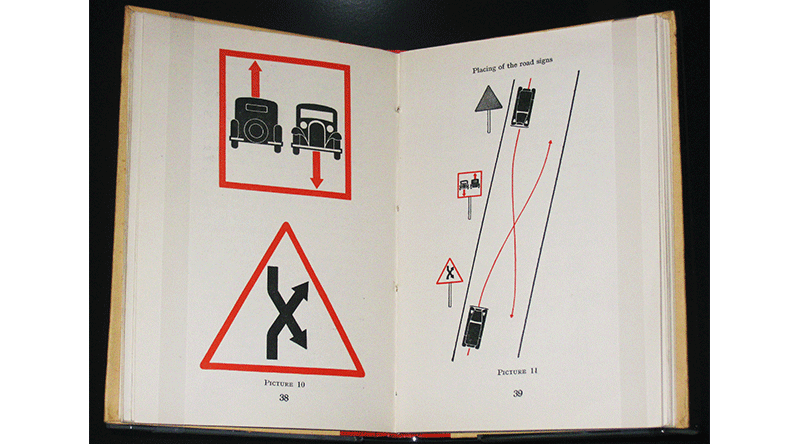
In terms of visualising the data and style there were two key figures who set the foundations for data visualisation. Otto Neurath who created the pictographic language Isotype (International system of typographic picture education) throughout the 1920s and 30s with Marie Neurath and Gerd Arntz.
The design of each pictogram is clear and succinct in terms of what it is meant to be. This is a principal whereby the greater the number is not represented by a larger picture, but by repeating more pictograms as the same size, which is ideally suited to that of the Office of National Statistics.
Between 1786 and 1801 William Playfair, a Scottish engineer, developed the graphical method for line, bar, area graphs and the pie chart, which have become the foundations of modern statistical graphics which are still in use today.
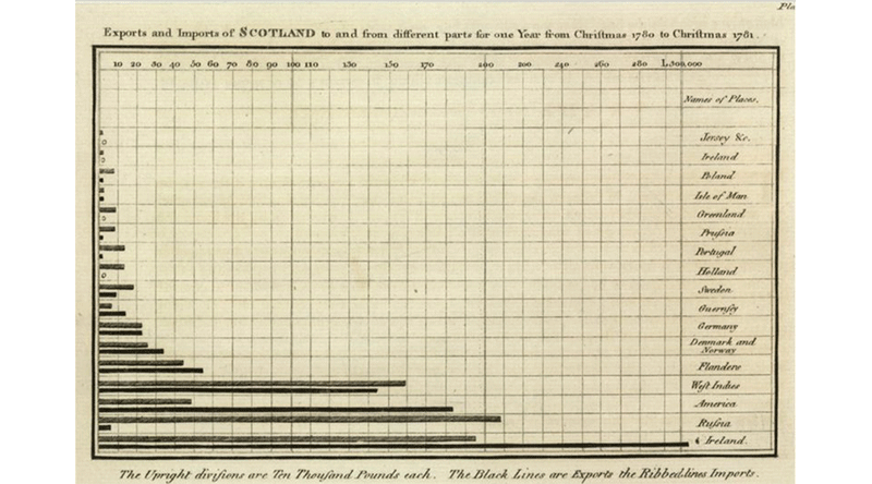 An example of a line chart by William Playfair.
Alan wraps the session up by focusing on the fact that numbers still matter as a form of statistical thinking, a system of interconnected processes. We should scrutinise characteristics in data as the data controls the drawing of any data visualisation to derive the value.
Session Three
Kelly Krause - Creative Director of Nature (Scientific Journal)
 Front cover of scientific journal - Nature.
The data visualisations in this session had a more illustrative quality than the previous sessions however, they conformed to the Edward Tufte discipline of generating graphics because the data is built on fact/research. Kelly and her team review their research to ensure what they are about to visualise conforms with the data. We were taken through a series of mind-blowing editorial work visualising galaxies and solar systems where she took us through the complexities visualising a believable sense of scale and ratio, which was dictated by the data.
Kelly highlighted the importance of researching scale when designing a data visualisation and set out a couple of points for the literal based on the data set and fact to interpretive representation:
- Research figures building on the research of others. There must be factual element to what you are representing.
- Scientific illustrations. Should easily decode information and data.
- Journalistic Infographics. Need to pictorially convey the data instantly.
- Editorial Infographics. These can take on an illustrative or interpretive approach.
This session added another view on how you can visualise and how explorative you can be when representing data. The visual is supporting fact but it can also be more than graphs and lines.
Final Session
Navela Shabir - Digital Journalist from the Guardian new media lab
Up until this point, this 1-day course covered data visualisation through origination, statistics, and editorial angles. In the last session we viewed the topic through the lens of motion graphics and video shorts, interactives and learned about how these can influence print layouts to complement stories across multiple channels.
Navela highlighted that simplicity is key. Always ask what is necessary? What is the crux of our story? What can we do without? This can help pinpoint your output and speed up the process of delivery - you can put a lot of time and energy into a piece with little margin for error. This was a theme throughout the day in confirming the data is credible, looking for spikes/anomalies, understanding the data set and how the graphics compliment the story while conveying the data meaningfully.
We were introduced to examples of motion data visualisations.
Motion design
If you have ever wondered how a black box works then this short video data visualisation will give you a very clear understanding.  How does a black box work?
Responsive
Earlier we mentioned data visualisation being a form of storytelling. This interactive conveys the story of a family trapped in the Tasmanian bushfires, to the lead up to their escape; it was a very compelling story well delivered.  Firestorm, a moving and powerful story of one family escaping the Tasmanian bushfires huddled up under a jetty for safety.
Interactive
Data visualisation can break down large topics into meaningful bite sized chunks. This interactive guide about World War I delivers an engaging experience.  A beginners guide to the First World War in 26mins
Following these examples, we were introduced to some of the tooling used to develop and realise the work we had seen:
- Timeline js for creating timelines
- Storymap js for creating stories
- Thinglink js for interactive images
- Angular js for building web apps with data binding
- D3 js for manipulating data docs into interactive visualisations
Nevela wraps the session with a couple of points to consider when designing and collaborating on a project:
- Motion graphics are a balance of creativity and budget.
- You should trust your instinct.
- Maintain an open line of communication between you and collaborators/developers/managers to air ideas and do not be afraid to fail.
This session really displayed how dynamic data visualisation can be from small supporting stills to stories high def interactive motion graphics. It reflected how moving and powerful data visualisation can be when you get it right.
Final thoughts
Data Visualisation and Infographics have become such an important part in supporting and conveying meaning to a topic. They act as a lure to capture the reader's attention, engaging them to find out more about the information in front of them.
There should be an equilibrium between the data and graphics, and ensure the medium does not overshadow the meaning. They can increase a viewer's dwell time on a page whilst helping us understand how people see/digest information in their daily lives.
In terms of a 1-day course there was a lot to cover plus plenty to think about and take away. It's been a few years since I did the course but it has certainly aided and enhanced the way I view data visualisation and methods when generating graphics.


