High-Res Prototyping Tips: How we eliminated waste and enabled collaboration
Collaboration is the ability to pull together expertise and ideas.
In our office you'll often hear the developers say 'lets get it working, while the designers get on with the chrome.' This isn't a case of passing the buck it's just enabling the developers to engage their expertise and deliver their part of the job effectively. This is the very start of the communicative process between the techs and the creatives.
Recently I had been struggling with the chrome for a particular control. However, it wasn't until I took some advice from a developer colleague that I realised I had no chance of styling it like my mock up. I needed to work within the constraints of the language or platform. It's these little nuggets of information that you receive through communicating and collaborating that are invaluable.
One of our recent collaborative projects is an idea from one of the endjin team; Mike Evans-Larah, who wanted to create "a better Azure Monitoring Solution". Mike had spiked a basic proof of concept and I was taken through its functionality, the user journey, data and the purpose of this app. While the project had been partially built, it wasn't finished; but there was enough to get started on styling the key areas in XAML. When viewed in a test environment, it worked but looked pretty rough and lacked a bit of visual T.L.C.
Before digging in to the XAML there were a few steps that I had to cover:
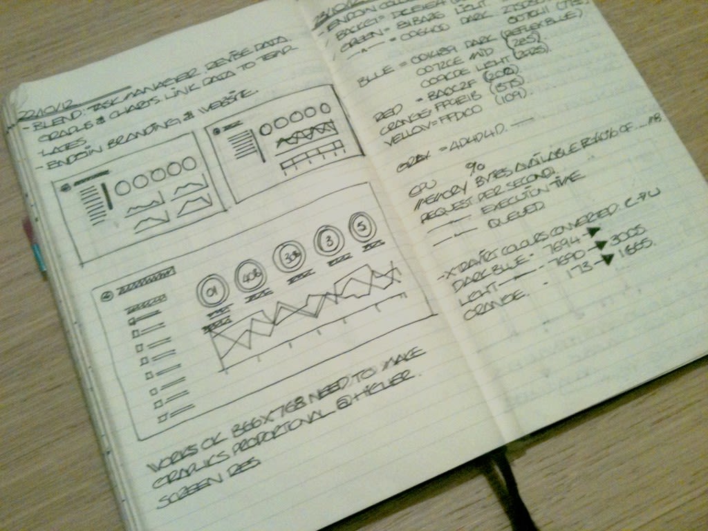
- I started to draw ideas in my sketchbook. I wanted to begin to build a face to the app. At this stage of the creative process it requires a lot of communication with the developers to ensure that I capture an effective look and feel for their work.
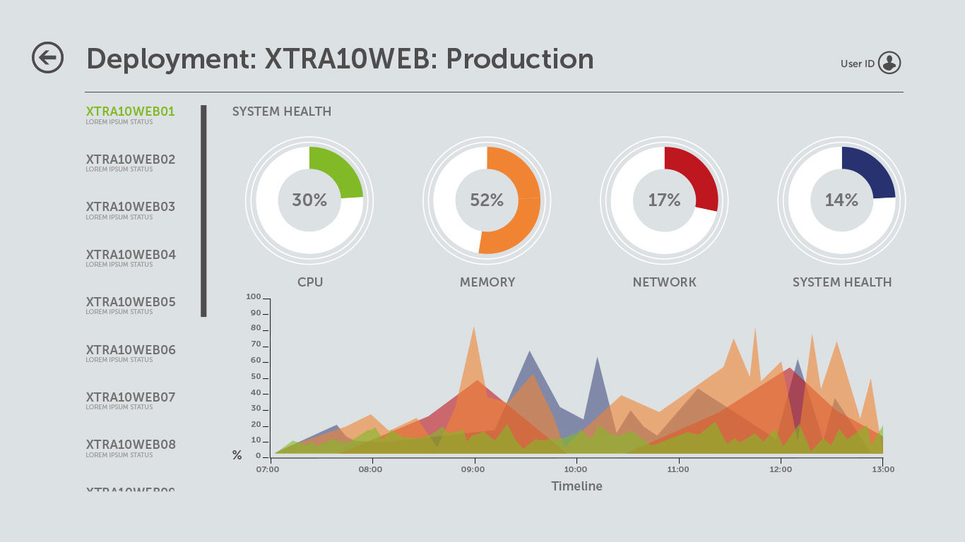
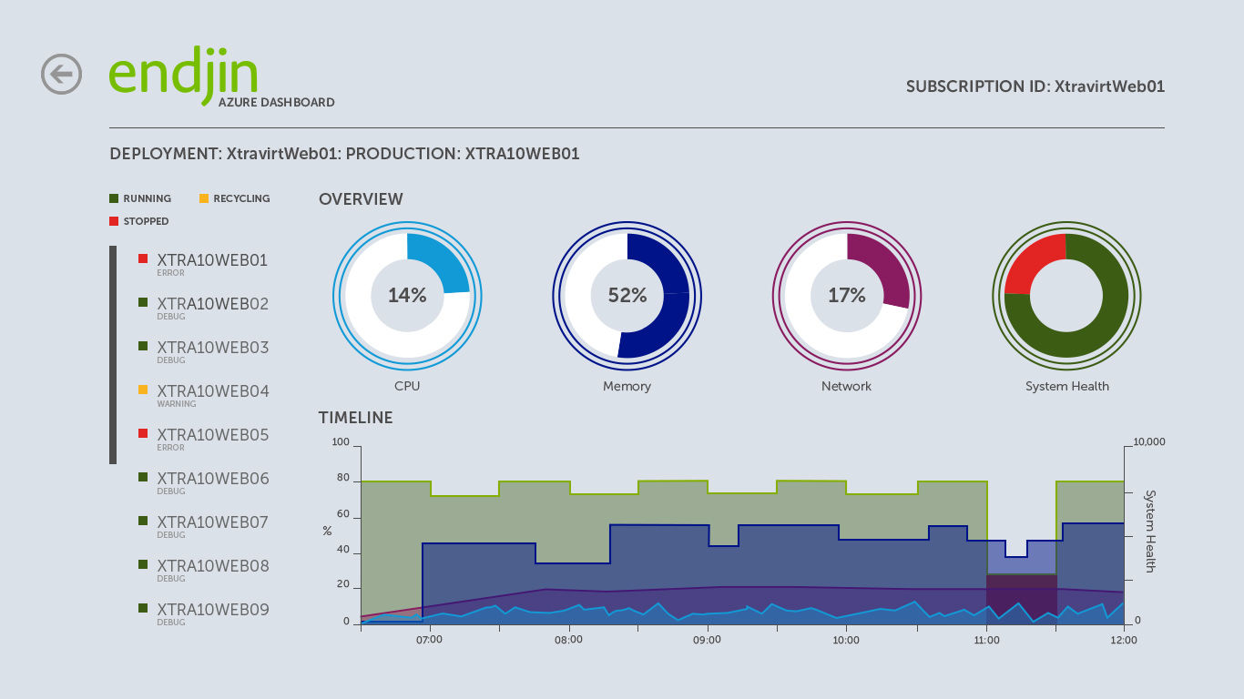
- With the sketches reviewed by the team, I turned to Illustrator to begin the next stage of prototyping. It was the preferred design tool of choice as then final artefacts were to be produced in XAML and I wanted the autonomy of exporting components directly to XAML or SVG. This also streamlined our proofing process where we could illustrate a journey through the app and export direct to a Surface device, as a PDF, for interaction feedback and general discussion. We could see immediately without diving in to the code where elements were working well, which ones need further attention and how the colours looked on a real device.
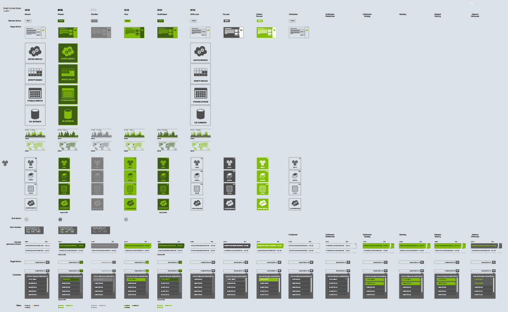
- We found that we could prototype quickly and this also gave us a high resolution crib sheet with which to start styling the XAML in Expression Blend. A designer who I work with regularly advised that I do this. Essentially, this is sheet (see below) where I visualise every components state used in the design and refer back to it when styling the app in Blend. It's handy to set your own datum within the design process as a reference point and you will see how many assets you have and if there are any overlaps.
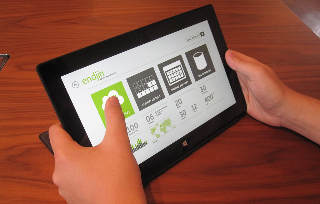
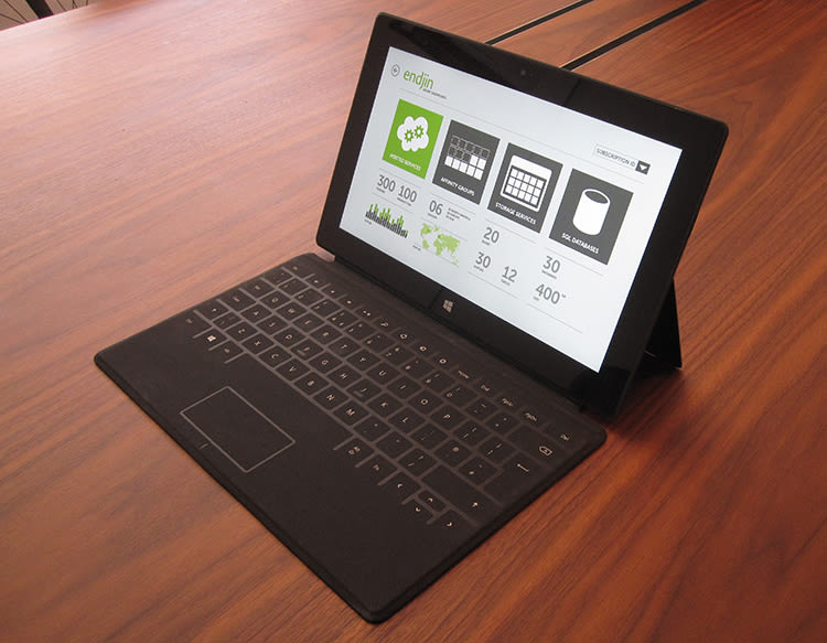
- Accessibility was another key issue. Through prototyping we could see if there are any typographic or ergonomic issues regarding button and link positioning. We used our high-res proofing process to make sure all of our links were thumb-accessible from both sides in both landscape and portrait orientations.
There's a lot of discussion and passing files back and forth between the designer and developer to achieve a working look and feel. I find that I can only go so far on a project before it needs a bit of dev love then invariably afterwards it needs a bit of creative love. This process of passing the project between departments continues until the job is done. At no point do we say 'that's it I'm done'. It's a team effort, collaborating and helping each other to get to a point where we're both happy with the end result.
Communication is key between the developers and the designer. Whilst there are some exceptional people out there with feet in both camps we cannot function without either discipline. The developers need to focus on the code and functionality, but also need to understand the design principles. The designers need to understand creative constraints of the code, but need to focus on shaping and moulding the style and overall appearance. One discipline cannot work without the other - and certainly not with out collaboration.
Designer Developer collaboration tips:
- Sketch your ideas first. It's quicker to use a pen and paper to begin the process and enables you to consider where you're placing your components.
- With the sketches in place, begin to transfer your ideas to Photoshop or Illustrator (whichever is more practical for your chosen project). It will speed up the prototype output later on. At this stage you will begin to see what is going to work well and what is going to need some further consideration.
- Set up your crib style sheet so that you can refer back to this when you're working on the code. You will also find out if a component or asset will need to be redesigned in line with the constraints of the target platform before you start to build it.
- Test your prototype amongst the developers. Get their feedback and take on board any changes that will make the ergonomic layout better and improve the overall user experience.
Collaboration can only deliver a good end result if you are able to communicate clearly and, above all as a designer, listen.

