It's more than just merchandise: Developing a visual language
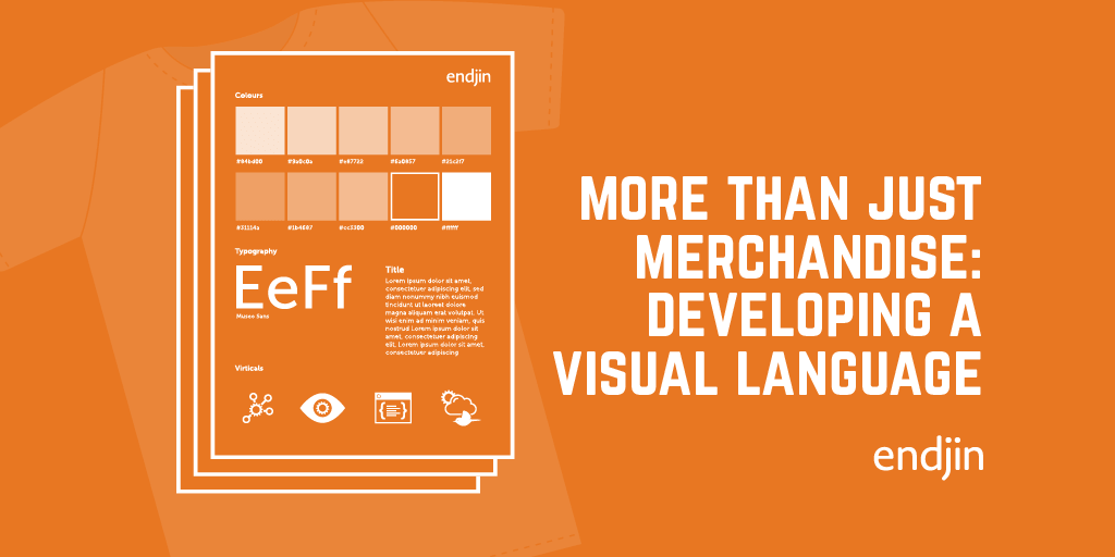
Since my last post we have been busy 'snagging' our site, building on our visual language, and pulling together potential merchandise. Like any brand we realise that it needs to continually evolve and be refined.
So what is our next step?
Now we have the foundations, we need to continue to develop our visual language and make it as engaging as possible to our audience: potential clients and contemporaries. We need to ensure that there is visual consistency across the board. We maintained a consistent visual brand message across our responsive website by ensuring that this was not watered down when viewed on mobile, tablet or desktop devices. Whatever device it's viewed from our visual communication is always cohesive and our identity is always easily identifiable.
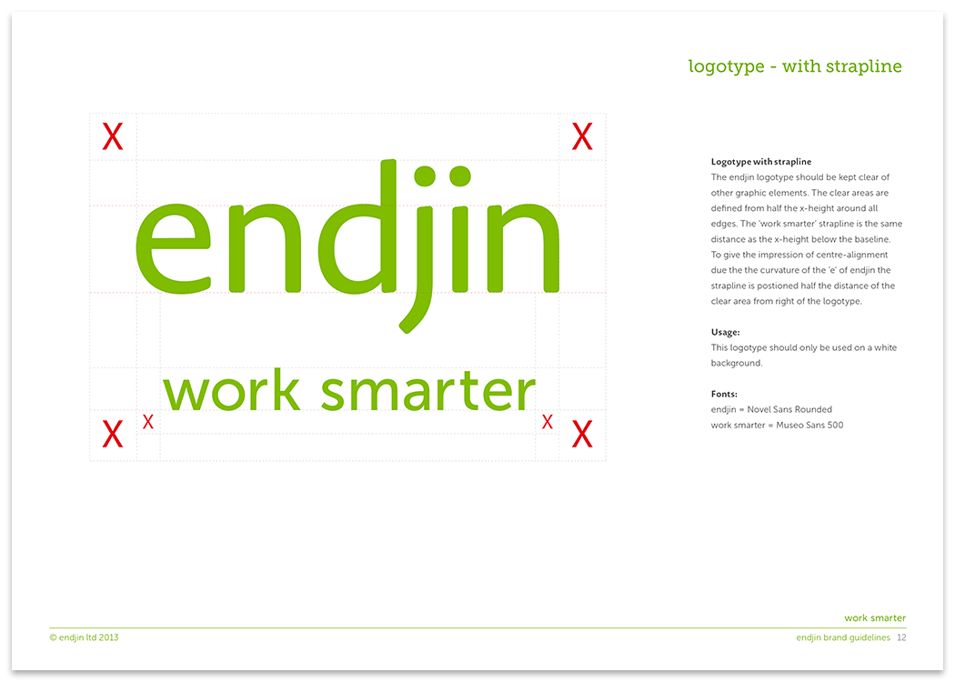
With the rules in place (we know what we can and can't do with our logo, for example) we can begin to develop our visual language across a variety of formats and 'be creative' in how we reproduce our identity across all aspects of our collateral.
Extending our identity in to our office environment through vinyls, furniture and signature colour, through to merchandise such as mugs, USB keys, caps, pens, coasters, glasses, and hey while we're about it, why not a plectrum? They're all up for grabs.
However, it's not just a case of slapping our mark on a wall or a piece of merchandise. These are add-ons (nice-to-haves) that we would not necessarily include in the initial design phase. This is not because they're overlooked, but because our thought processes were geared towards theoretical decision making centered on longevity: how are we going to build our brand and what design processes will we enlist to achieve our aims and objectives?
Every aspect of the design has to be considered from size and rationale, to whether or not what we are doing is going to be of any use to anyone. There's no point in having bags or caps if you're not going to use them.
![]()
In developing our visual identity we have had to consider whether or not it will be recognizable. I mentioned in my previous post that we began to develop a unique visual language that needed to work if you took our logo away. That's where our iconography and colour ways take center stage in our design process.
We're still in the early stages (some 6 months in) and we're happy with how the visual language is evolving but we also know that we have a lot of work ahead maintaining and refining our identity.

