How to Build Mobile Navigation in Power BI


In my last post we spoke about incorporating UX practices into Power BI navigation. This got me thinking about mobile navigation and how that would work in Power BI.
There are currently over 6.5 billion smartphones users worldwide — a number that’s projected to increase in the coming years. Exploding Topics
- In 2022, 86% of people used their mobile to go online, compared to 28% in 2009.
- Almost all (98%) UK adults aged 16-24 now have a smartphone.
- In 2023, 87% of UK adults own a smartphone. 96% of 16- to 24-year-olds own a smartphone, whilst just 69% of over-65s own a smartphone.
- Brits spend an average of 4 hours and 14 minutes a day on their smartphones.
- There are 66.11 million internet users in the UK, around 98% of the population.
So, with that in mind we should consider Power BI for Mobile.
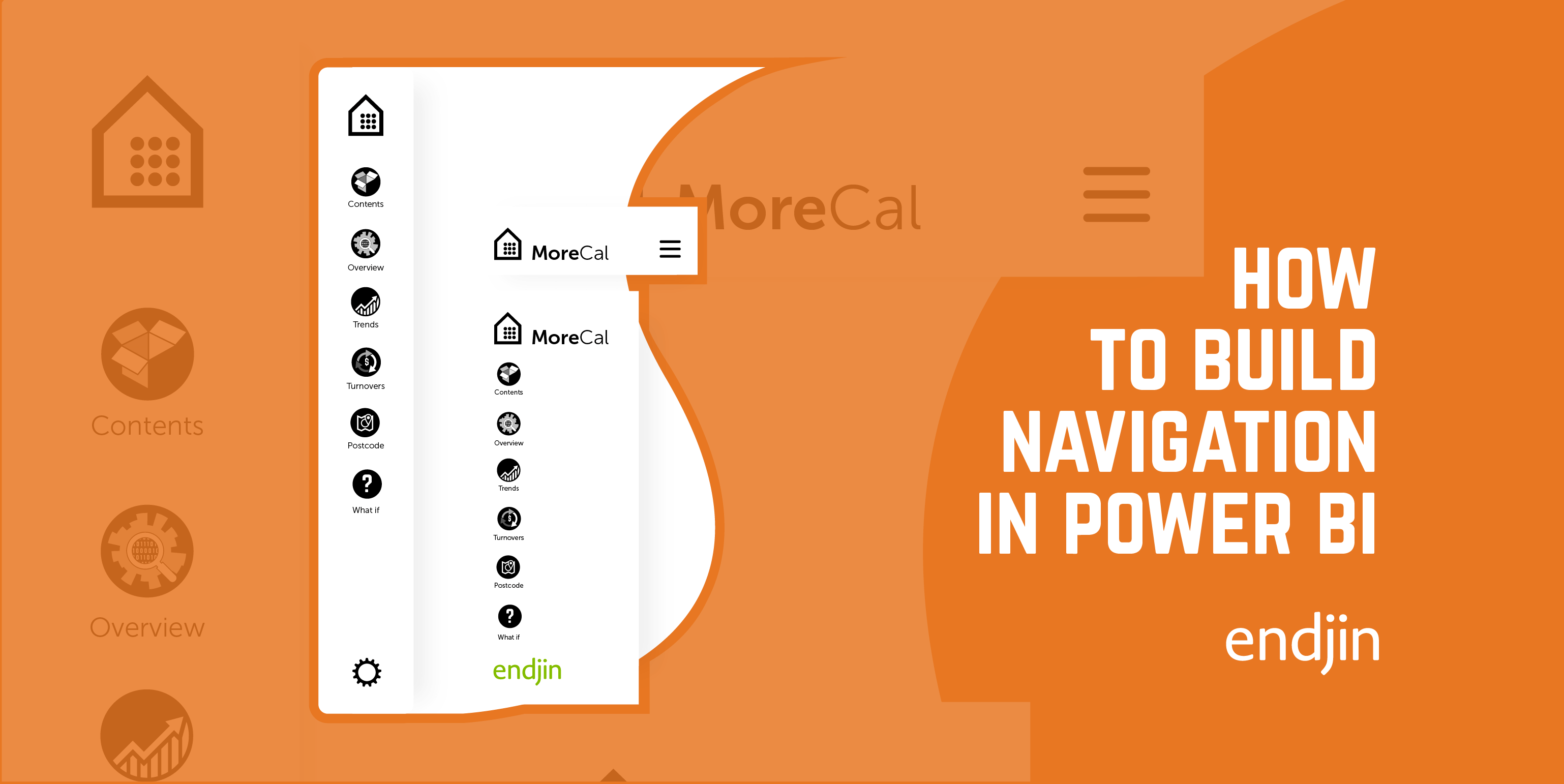
Building our Mobile Navigation.
When you’re building mobile navigation, we use bookmarks to record the different actions. This records the navigation in certain situations. Bookmarks are intrinsic to making this work, but you have to turn off the ‘data’ and ‘current page’ views so, that your navigation will appear on any screen and not bookmarked to a particular data view.

One way to add formal UX practices is by integrating navigation. This allows you to taxonomize and categorize our data across your user journeys and touchpoints. Navigation follows patterns, you would normally find our main nav at the top or the left-hand side of the page. Then there is local navigation which could be a sub nav within a section down, then we have contextual navigation. This takes the form of links within the body of the text which link out to articles and spacing out the dataset.
So, before we can start building our navigation, we need to generate all the assets we require. This can take the form of a cover, icons for buttons, illustrations, and a brand - if we don’t have one supplied.
Once we have all our assets we can begin building the navigation. If you’re not a designer I pointed to a series of icon libraries in my previous post. Here they again: The Noun Project, Flaticon, and Fontawesome.
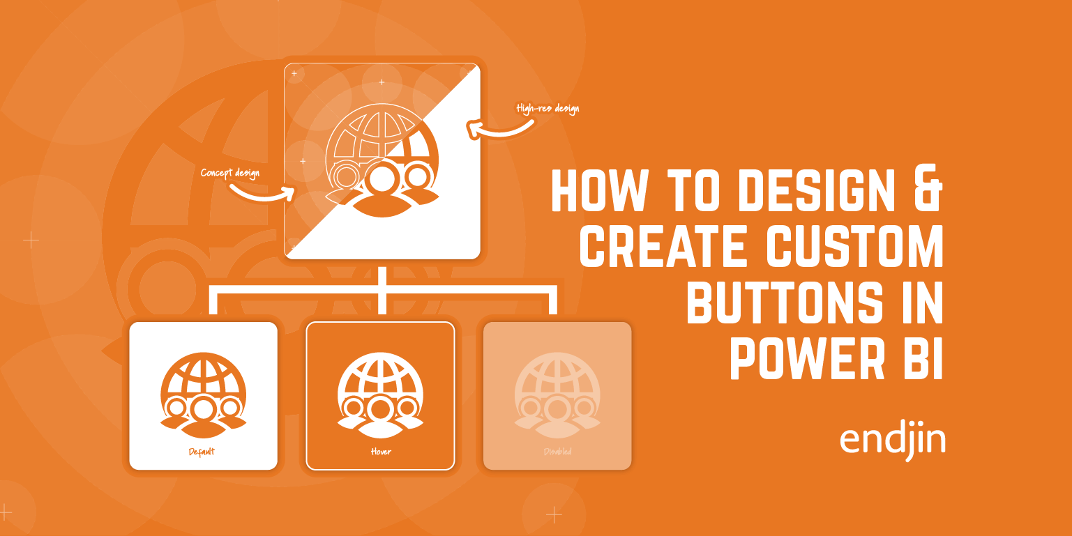
We build everything in the desktop view this will transfer over to the mobile view. Its quite the same as it we build mobile first. If it’s not in the Desktop view then it will not be in the Mobile view. What we do is set the mobile nav up on desktop and then we hide the mobile nav on desktop. The first item we look at building in the buttons that navigate us to where we want to be. Please read my previous post on how to make Custom Buttons.
Now you know how to make a custom button. But here’s a quick recap. Under the icon tab in the side menu, you will need to select Custom from the dropdown. This will expose the custom Icon finder below the title. This will allow you to add your own icons. Generally, what we is set one button with the states and what Power BI will do is retain the states so all you have to do is swap the icon out however, you should always make sure you’re swapping the icon make sure you’re on the default tab only as this change everything on all states.

Once you’ve set your nav button up with the states you can then duplicate for as many section as you have. Then all you need to do is swap the icon out. To finish our Mobile nav we add buttons to open and close the mobile navigation because with space a premium you’ll not want your nav constantly open. So, you will need hide it or condense the navigation. We follow convention and use hamburger to open the nav and a back arrow within a circle to close the navigation.
It’s handy to follow tried and tested iconography here because it’s what the average user will be looking for. We’re trying to reinvent the wheel, just follow standard UX practices. Once you have these set up then you’ll need to use bookmarks for the open and close states. Now Power BI is pretty standard there will not be fancy animations although Power BI does good job at smoothing the animation out. This partly due to the Windows Animation API includes an timing system which helps to endure that the animations are displayed at the correct frame rate.
Final thoughts and recommendations
In this post we are going to overlay UX practices and build on them and make reporting look more considered and intentional. We need to build stories and journeys into our reporting because data has a story. It’s about exposing and surfacing these topics and meaningful outcomes from the data we are presenting.
In this post we have walked through how to build a custom mobile navigation bar in Power BI, how the navigation can enhance the layering of your data storytelling. The process is quick if you have all the collateral ready, it takes minutes to compile a button that reflects your brand language. It's Ideal for instances where you require bespoke navigation, bookmarking, and links. You can extend your brand language through design and developing icons for new instances. However, if designing is not your primary focus, then we have provided a series of well-defined icon libraries where you can select from a range of designed icons to suite your needs. It's a great way of extending your visual identity across all aspects of your data visualization and reporting UI.
We hope you’ve found this article useful in developing your own navigation.