Visualising Technical Content - How we Design our Blog Headers
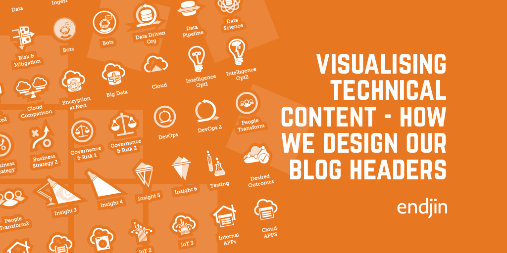
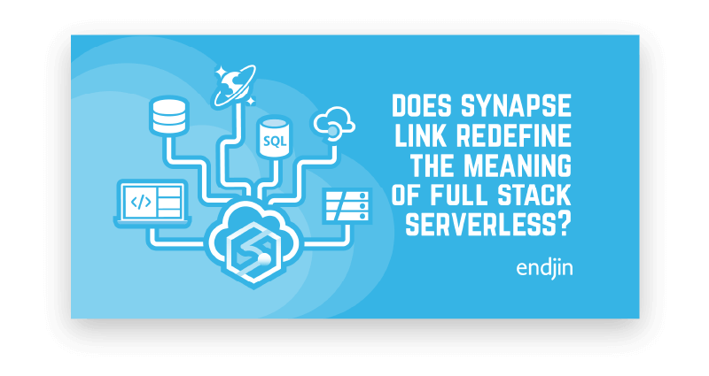
If you are a regular reader of our blog, you will have noticed that we introduce each post with a graphic header that offers a quick visual representation of the topic. The purpose of the headers - aside from adding a colourful image to each blog - is to enhance each post so that it stands out across social channels, supported by our brand language.
Endjin's content is based on real time use cases; we talk about the abstraction of our experiences across the Azure, Data, and Software engineering ecosystems. The topics can be highly technical and the header acts as a visual narrative to summarise the post and easily recognisable as endjin content within a social media feed. It therefore requires a consistent, branded approach that registers with our target audience that this article is of interest and worth reading. In this post we are going to talk about how we design and create our blog header images from ideas to finalisation.
Icons, Pictograms, Ideograms.
On first inspection when presented with an example of an Icon, Pictogram, or Ideogram it could be argued that they're all icons however, there are subtle differences between them. The core of our imagery is comprised from these 3 definitions so I thought I would start with a short outline between these forms of graphic representation.
- Icons An icon is a graphic that symbolises a significant meaning, usage or function. They are the oldest form of visual communication dating back as far as cave paintings from the prehistoric era to the Byzantine (3rd to 8th century). They can be religious icons or specific to an area or topic but succinctly convey a meaning visually. A modern example of this would be a cloud icon to indicate cloud computing or cloud technology.

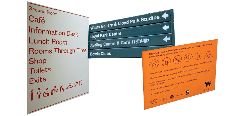
- Pictograms A pictogram is an icon, but its a literal representation of what they resemble: a place, object, or action. Road signage or way-finding throughout Airports, Museums and Galleries or Public spaces are good examples of this type of graphic.
- Ideograms An Ideogram is an icon or pictograms that represents an idea or concept. Examples of ideograms can be a house icon combined with a server icon to represent servers on prem. A cloud icon combined with an arrow icon symbolises uploading to a cloud directory, or a lightbulb with lines radiating out from the centre to indicate an idea or thought process is taking place, or about to happen.

We use these 3 image types to form the core of our visuals and expand our brand language. They have to immediately register with the viewer that this is a piece of content that's worth their time reading amid a sea interesting content by other producers. In order to do that we design and utilise iconography as a vehicle to rapidly engage our target audience, to the point that it becomes a subconscious recognition as an article scrolls in to view that they can identify with it and want to read it.
Ideation
How do we shape our ideas? First of all, it is important to read and understand the content. This is where those little images pop into your thought process as you're reading. If there are difficult concepts to understand like an abstract technical theory then a quick call or simplified synopsis helps to get the visual process off the ground. Often when it comes to illustrating content, it's one word or sentence that generates an idea which will make everything click, and hinge your entire visual context from it.
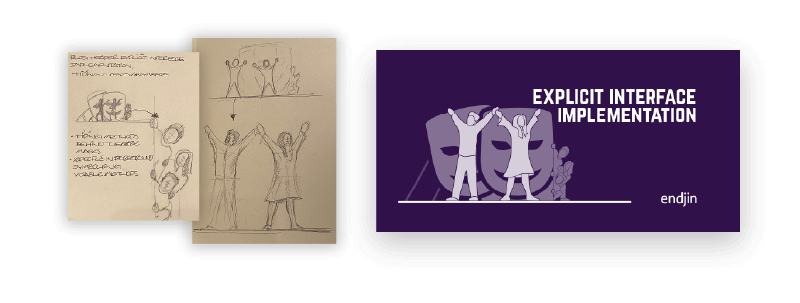
Once we have an idea we begin sketching concepts within our blog header template which has predefined columns, guides, and indication of clear areas for social channels. When we're happy that the concepts designs are conveying the meaning of the post we progress to the next step, sounding it out with the author. This helps to validate our ideas and whether it is what they had in mind.
Design
When the concept is agreed we move onto the next phase of design, refining our idea into a high-res version of our concept sketch. We start by progressing ideas for new iconography if required, layering up imagery using tints to add depth, promote top-level items, and setting the balance with typography. When it comes to designing a new icon, it can be viewed as the simplest form of visualisation but condensing a meaning into an immediately identifiable resource can be challenging. So, quite often there is another round of feedback with the author to validate whether the visual relays its intended meaning.
The net result with each new icon we design, is that we then add it to our own visual asset library, which is used across all company collateral; from presentations to promotional material. The library becomes an invaluable item of creative IP for reference and developing ideas. Within the library we can reuse an icon for its intended meaning or it can be used as a base towards a new asset.
This has enabled us to build a self-service PowerPoint deck so that non-creative members of the team can produce their own graphics based on the visual toolkit provided. We chose PowerPoint because this is a package that everyone in our team is familiar with both in terms of access and experience in developing their own presentations. Choosing the right program that our team are familiar with reduces friction in having to learn something new and aids adoption.
Our template starts with a blog header example and guidelines followed by a series of icon/pictogram/ideogram asset pages, and a 'things to avoid' page. We outlined a specific set of guidelines which indicate to our team where to place their image content in accordance with a text placeholder and branding. We indicate the optimum clear areas for branding and areas to avoid cropping their artwork awkwardly when viewed in a social media feed. When the team have familiarised themselves with the template, they can delete all sample images from the example, and create a new image by copying, pasting, and resizing new imagery from the asset pages provided. This is also the point where we might update the asset library by revising or developing new creative elements inline with the topic.
Each blog header then goes through a creative approval process where we check the spacing, legibility, messaging, and clear areas. By providing the rest of the team with a simple toolkit it speeds up the workflow and communication of ideas between technical and creative disciplines.
Finalisation
When the design is agreed or effectively signed off we output it as a PNG. We don't tend to add much compression when we export our content as we do this via Tinify before uploading our image to Cloudinary's Content Delivery Network. This image is then referenced in our post. From ideas to finalisation the design process can take between 30 mins to a couple of hours depending on complexity, whether or not we're required to design new iconography, or if we're re-skewing designs to a new or similar meaning.
Final Thoughts
Being able to drawdown on our creative IP really helps to speed the process of generating ideas and content. Over time we began to build a system of icons, pictograms, and ideograms which have an unspoken similarity, all different but the same, you know when they are the right fit or not. Aside from graphic design we set style parameters around line weights, borders, and sizes so that our design sits within the same visual family. What began as little visual experiments to elevate our blog post content and engage readers so that they can distinguish our content while scrolling, has steadily become a mainstay of our imagery and helps to reinforce endjin's brand language.

