Reasons to: Round up of the Sessions I Attended
For some reason, even though I left school years ago, September seems to mark the start of a new year. Probably because that's when schools do go back after the summer, my mind is sub-consciously stuck in that cycle and importantly this year our eldest begins a new chapter in his life – of starting school himself. It's also exciting because for the last two years I have attended Reasons to… (formerly Reason to be Creative and Flash on the Beach) a 3-day event held in Brighton organised and hosted by Johnny Belmont and his team. The event pulls people together from a variety of disciplines: design, development, illustration, 3D modelling and data visualisation to name but a few into an explosion of creativity.

When I step off the train and head down to the venue I know that I'm going to be enlightened and saturated with information – sometimes I walk away at the end of the day thinking what am I doing with my life? But hey that's good right? Because it keeps you in touch, and hopefully spurs you on and pushes yourself further. Every speaker is here because they've worked hard, triumphed against adversity, failed in some cases, and come out the other side smiling with something interesting. It might not have been what they were looking for, but that's how ideas evolve. They start off at "A", then move off in myriad directions and they as the creators, or experimenters, challenging an idea are pulled along in a tsunami or trickle of creativity – circle as required.
Here's a little round up of the event and the sessions I was able to attend.
Day One
I arrived just in time for Yves Peters talk missing Nelly Ben Hayoun's opening session - damn trains
Yves Peters - Raiders of the Lost Glyphs
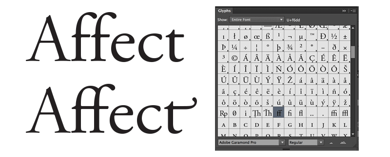
Yves Peters talk on typography and open type was exciting and really insightful. The thrust of his talk was about the development of open type since 2000, stylistic sets and how we as end users until 2014 could only access a fraction of its capabilities owing to interface design stagnating. He exposed the rich features of these fonts, which had previously been hidden 2-3 steps down within apps UI and got you thinking as to how you can like Standard ligatures and stylistics alternates. Yves has a really interesting post you should check out on the topic.
Since 2014, Yves has been part of a collective push to improve this experience in collaboration with the Adobe Typography Customer Advisory Board. Some of these changes can bee seen with the glyphs panel being surfaced much higher in the UI.
Jim Stoten - 'What sort of stuff do you do?' and much more.
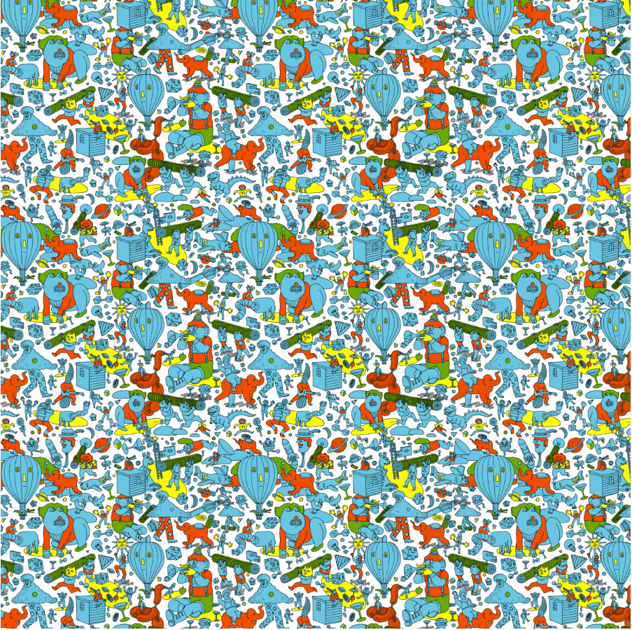
Really enjoyed this funny and witty session delivered by Jim Stoten. I was blown away by the sheer lunacy, creativity and intricate detail of his work. The subject of this talk was So What sort of stuff do you do? A question many a creative struggles to answer quickly because invariable they cover a series of tasks and often feel quite privileged to occupy the job that they do. James shared some of the peaks and troughs of his career from a bird shitting all over his work before a presentation to his collaborations in art and music with Mike Perry.
Gavin Strange - Workin' & Merkin' (Designer at Aardman)
Any thoughts post lunch nap were exorcised from reality as Gavin's energy filled the room. He has interests in everything, embracing creativity from all angles. If you've got an idea, see it through, it doesn't have to be for money and sometimes the most creatively rewarding projects aren't paid for. My favs were the Doomtree posters and the Legacy Gromit's.
Jessica Hische - In Progress
Jessica started with a short anecdote about the elaborately scripted tattoo on her arm, which says 'Type' but it had been pointed out to her some time before that it is in fact styled as Lettering. In that moment we all learnt a brief lesson often overlooked, of the distinction between "Type" and "Lettering". Her work is beautifully laid out lettering, crisp and clear messages making the drop shadow very acceptable. Jessica outlined her creative process, the development of her ideas and delivery in 5 stages: Researching, Brainstorming, Thumbnail Sketching, Sketching and Vector drawing. It was a good insight into her processes and idea development.
Erik Kessels - Your Mistakes Could Change the World
Erik took us on a very humorous branding and advertising journey from the re-branding of the Hans Brinker Budget Hotel and how this developed in to a long professional relationship advertising a hotel whose greatest luxury is their honesty. To his photographic and found imagery projects dealing with the beauty of mistakes and turning these failed, kitsch ideas into works of art. His Useful Photography project has spawned a book or two. He shared a very poignant project called Unfinished Father about his father who had suffered a severe stroke. Prior to his stroke he had been very active restoring Fiat 500 Topolino's. Erik's project takes the last unfinished car his father had worked on and displays it as a piece of art stalled in time, never to be finished or completed. If you get the opportunity to see Erik talk … Go! You'll be enlightened and amused although, be warned he might start sharing some massive cock pictures from the Useful Photography series.
Stefan Sagmeister - Why Beauty Matters
I've been itching to see one of his talks for some time, and now finally had the chance. The topic was Beauty and why it has been a forgotten word in and around design of the 20th and 21st centuries. He talked about how Austrian Architects like Adolf Loos began to streamline buildings removing intricate details in Looshaus in Michaelerplatz, Vienna (The building with no eyebrows), the beauty of underground stations highlighting a comparison between the post war stripped back stations in Munich to the ostentatious opulence of those on the Russian underground. At this point you're thinking I have to see these stations. We were also shown some of the work his practice produced for cloud software Fugue . The brand wanted an identity, which reflected the transitory nature of their software by developing an application that enabling the teams behind the software to import SVGs and animate them. Allowing this brand build and evolve with a real sense beauty and dynamism.
We saw what was a rundown low-lit underpass, used as a public toilet transformed into a well-lit underpass dressed with beautiful coloured murals on either sides by Yoko Shimizu (a speaker at last years event).
If the word Beauty had been under used in design then there was plenty to see during this talk.

Day Two
Boasted some great session from Andrew Spooner, Pete Daukintis, Mario Klingemann, Ben Newman, Marian Bantjes to Mister Bingo and Jared Tarbell.
Unfortunately, I missed these sessions, because of the all important "first day at school"; a proud, yet emotional day in any parent's life. Primarily because if you blink, you miss it. Tuesday 6th September earmarked for me how quickly time passes, and you must try to savour every moment, be it at home or, in your professional life. Capitalise on your ambitions, but don't forget your family.
Day Three
Wednesday back in Brighton for the last day of Reasons to. Remember I said blink you'll miss it? This 3-day event flies by. Starting with the elevator pitches. This year 14 hopefuls took to the stage to deliver a 3-minute presentation with the aim of getting enough votes to speak at next year's event - I doff my hat to all those who take to the stage. It's hard to condense your message into a succinct and clear presentation against the clock but they all did exceptionally well.
- Karlin Mohl - Part of Awkward Sisters
- Jo Summers - Jo had a pop up arcade as part of Brighton Digital Festival
- Steve Lloyd - Proving that in a digital world we all opt for a bit of analogue no matter how hard you try, everyone starts a project with a piece of paper or card. Check out his Kickstarter
- Ade Mills - He also has a great podcast - the Design Jones
- Nadiah Bramer - An Astronomer turned data scientist and visualiser
- David Keeney - RDB Host
- Axel Gutschenreiter - Digital Creative and Art Director
- Will Appiah - Digital Shoguns 3D specialist in toys and games
- Kate Greenstock - Talked about finding true value and nurturing talent
- Phil Corbett - His illustrations and animations are knockout
- Abi Fawcus - Generates digital landscapes by mixing up the pixels as a result of a camera corrupting her images
- Donna Churchman - Creative Block and Flow
- Holly Budge - How Many Elephants a project highlighting how many elephants are poached for their ivory and promoting a natural alternative
- Michael McDermott - Explores a global project for creatives admired by creatives based on the 6 degrees of separation
Stacey Mulcahy - The Tinkerers Toolkit
It's the second time I've seen Stacy talk and she is a great speaker, very engaging and another person who if you get the opportunity to see her talk then do so. Stacey's session was all about exploring new tools available: failing and failing fast, exploring the use of tooling and code within the creative process to test what's out there. A bunch of cool stuff came out in her talk like: HTC Vive Steam VR , Aframe, The Other Mill, Fusion 360, Axidraw, BBC Micro:bit, Wegazer.js .
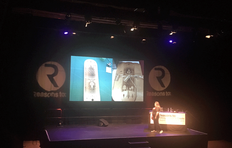
Jam Session
This gave us the opportunity to see 5 speakers that we may have missed throughout the event. It was a session where each speaker talked about the topics not included in their sessions
John Howard spoke about developing digital games for the BBC, Jim Stoten, talked about an impending deadline; the detail of this work, and the projects that side-track him. Ben Newman, spoke about his mask project, which started out as a bit of fun, but ended up cementing his relationship with his father, who makes the masks into beautiful objects. Mario Klingeman gave us an insight into Machine Learning, and how he used this to select slices from different films to display time in real time, and Jared Tarbell who took us through some amazing images of his works and the desert where he lives.
Wilfred Wood - Heads
A true master of modelling heads, animals, and figurines out of Plasticine, a figurative sculptor. He started out making the puppets on Spitting Image in the late 80's and early 90's. He then took us on a journey of the work he's created through the years, his commissions and unbelievably, how he destroys most of his work once it's photographed so he can reuse the materials.
Seb Lester - Peace, Hellfire & Outer Space
Starting with his time as a student, generating incredibly detailed paintings and illustrations. Over the course of time, he realised he was drawn to the letterforms within his work, culminating in developing typefaces when he graduated, with varying degrees of success. The joy he would get when he saw his work appear in an advert on TV. Developing the Neo Sans typeface used across advertising campaigns, and branding for Intel, and the Vancouver 2010 Winter Olympics, to designing a logo and iconography for NASA SWOT 2020 space mission. His work is powerful and beautiful.
Joshua Davis - Painting with Sound, Mesh, and Shader
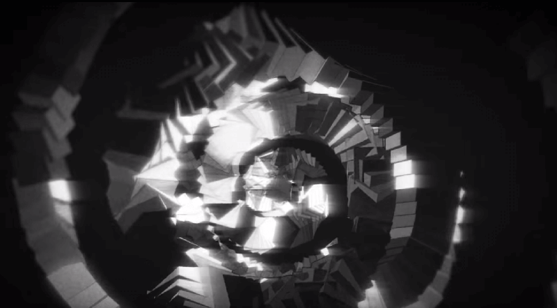
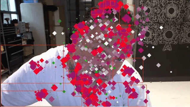
Joshua was the last talk of the event and wow! He certainly made sure you were listening. He charted his work on music videos for Phantogram, Nine Inch Nails, Pepsi and Pharrell to building 3D environments Painting with Sound using Meshes, Shaders and +Hype. This is what I love about events like Reasons to. You get introduced to avenues of work you never knew existed. Painting or working with sound and code to create stunning graphics in immersive environments seems an unlikely mix but Joshua's work is just that stunning, vibrant and innovative. Particularly liked his face mapping experiments.
At the end of the event you feel a creative boost of energy, inspired by the sessions you've seen and the lessons learnt. The main take away for me was that it's ok to fail and try not to take failure as a process that does not go anywhere or stops you in your tracks. Seek the positives from failure and consider whether you can give mistakes a new lease of life like Erik Kessels. Sometimes you have to take a step back from your creative processes and reassess the tools you use like Joshua Davis or sometimes you just need to try out new tooling and experiment more to see how this informs you, like Stacy Mulchay. Don't be afraid to play a little. Approach your work from an oblique angle you may be surprised with the outcome.
See you next year.

