Generating custom themes in Power BI – A designer's perspective


Recently I have been busy building a custom Power BI theme and I thought I would share some of the elements that I have learnt. Initially I had viewed Power BI as quite limiting in terms of styling partly because Microsoft do a pretty good job at providing an out of the box solution to data visualisation and partly because I needed to understand more about the app and how it can be adapted visually.
Looking for inspiration
The Power BI Theme Gallery is a good place to start so that you can see other treatments for report styling which can get the creative juices flowing and provide an insight into the possibilities when it comes to report styling.
Basic styling and getting set up
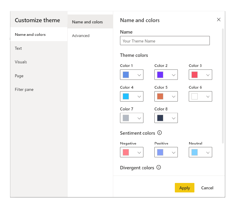
There are essentially two channels of customising a Power BI theme. The first is basic customisation via the App under the View/Themes/Customize/Current Theme. This will give you access to Name and Colours where you can reset your primary and advanced palette.
- Text which covers your font family, size and colour for the Body, Titles, Cards & KPIs, and Tab headers.
- Visual for Background, Border, Header, and Tooltips.
- Page for setting Wallpaper or Page background colours.
- Filter pane is the last option and here you can customise the background colour, filter cards, transparency, fonts and font size.
Advanced styling and handy tips
Once you have applied these changes it leads me to the second more advanced channel; custom JSON style sheet. You can save this current theme as a text file. I used this as a starting point for building my own custom JSON file. The following are just a handful of tips that I learnt and found useful.
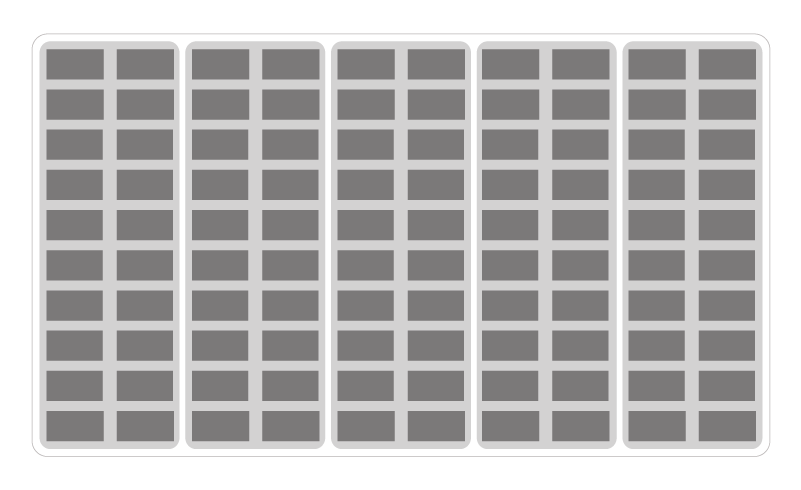
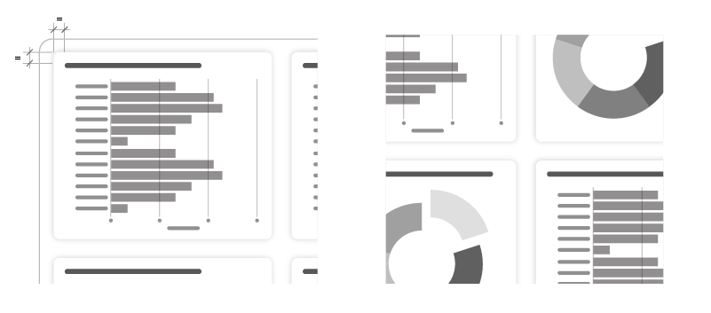
Grids and layout are a good starter for ten. Building you own grid or referring to others reports to view how they have done theirs is a good lesson. Designers use grids and columns all the time to help build structure maintain consistent spacing between your content. You'll also see when a layout is overloaded and should split into a new page.
Colours are route 1-0-1 for a custom theme setting up a custom palette. Swapping out your colour palette to something more in line with your organisational colours can provide quick results. As described earlier you can do this via the app and saving the theme will help you visualise and structure your JSON doc.
Fonts You can add your own font to the report but you cannot package the font when publishing the report. It would require everyone viewing your report to have your fonts saved locally. So, the best option is to pick one of the pre-canned fonts that is closest to your branding. That way your presentation will look consistent to all viewers and you have total control over the font style and typography.
Padding & Spacing Workaround - currently, it is not possible to add more padding to your charts and graphs via the JSON file - lots of googling and trying to hack a JSON file has proven this. The current solution takes a manual approach. To add a bit more spacing between your chart title/content the border you can add a shape to the area you want to cover on your grid. Then bring in the edges of your chart in so that the margin looks equal or using the General tab in the Visualization panel subtract the margin from the height/width of the chart and centre your chart on the shape. You can then add borders and drop shadows.
Drop-shadows used subtly can add or enhance the spacing between your content without having a hard border or line breaking the space up. We added a drop shadow to basic shapes which you can set within the JSON however, when you import the theme you will apply this effect to every basic shape. If there are instances where you do not require this effect then you can switch this style off these objects in the visualisation panel. The downside is you will have to toggle the effect on/off every time you reimport theme which could be time consuming. We set this effect up manually on a basic shape then copied and pasted it as required.
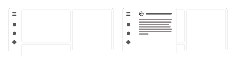
Navigation If you're looking to build your own nav to replace the Power BI tabs and enhance your organisations visual language then you can build a nav header that can run across the top, down the sides, or along the bottom the position is up to you. Layer up your nav starting with you background then your hamburger icon, nav icons, and brand mark.
Your hamburger icon can be used to reveal a side panel when clicked. This can contain relevant information to the slide but does not need to be in constant view. Utilising bookmarks and actions will enable you to set open and closed states. For the nav icons set a destination to the target page via the Actions panel when formatting an image. A handy tip is to add the button title to the tooltip so that users can see what the icon is relating to.
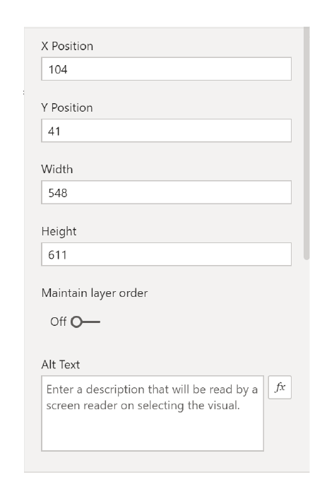
Alt text is important from the perspective of accessibility. As you are building your report you can add the alt text via the General pane under Visualisation. This will enable screen readers to translate the content making your report more accessible and inclusive.
Resources
Here are a few resources that I found helpful in terms of descriptors, labelling my styles correctly. Read Microsoft Power BI desktop report themes first, it will provide an in depth view of all the touch points when it comes to custom themes.
Power BI Tips is a really handy online tool where you can set the styles and build your custom theme for the chart you're using. Once you have added the styles you can download a JSON which you can build upon. I found it helpful to toggle between this web app and the Power BI so I could set my style manually and convert that into the JSON file.
When I wanted to dive deeper I referred this GitHub repo to help me understand how and what label could be applied to each element.
Final Thoughts
Generating your own JSON file. Being more on the visual side of things coding is not the first string in my bow however, building your own JSON style sheet is very rewarding. It's very satisfying writing a few lines of code then watch those style changes take effect when updating the report theme. Equally, when the styles don't act as expected it becomes a problem-solving exercise, working out which line of code is wrong or maybe you're just missing a parenthesis or comma.
And there we have it for now. These are just a few hints and tips that I have learnt as a designer whilst exploring the possibilities of developing your own custom theme in Power BI.