How can I improve my data model in Power BI?

I have already written a blog around loading and shaping data in Power BI. In that post I ran through how to build up a model in Power BI to support report visualisations. This included merging and manipulating tables, cleaning and shaping the data, and building relationships between different parts of the model. All of this forms the base for the high-level reporting which allows you to deliver insight using Power BI.
There are however some other things which can be done in order to improve your data model. The first of these is to configure model properties.
There are a few different model properties which can be configured. Some of these I have already touched on, but are used to make the model more discoverable:
- Object names and descriptions – setting these helps users to understand what different values contained in the model relate to.
- Hidden objects – Hiding objects which aren't useful for reporting means that the mode is not cluttered with objects which are meaningless outside of relationships and internal calculations.
And some are used to improve the reports produced by the model:
Data types and data categories
Ensuring your columns are the correct data type allows you to perform specific operations over the data. There are many data types: Whole number, decimal numbers, dates and times, text, true/false, binary. Each of these unlocks specific functionality.
Power BI can also infer things from within a data type. For example, it can infer that text data can relate to a specific geographic location which allows you to visualise your data on a map. There is sometimes a little more complexity in getting location data into the correct format, but this can be a powerful tool in bringing your data to life.
For example, if we use our data model seen in previous posts and display the number of children by city on a map:
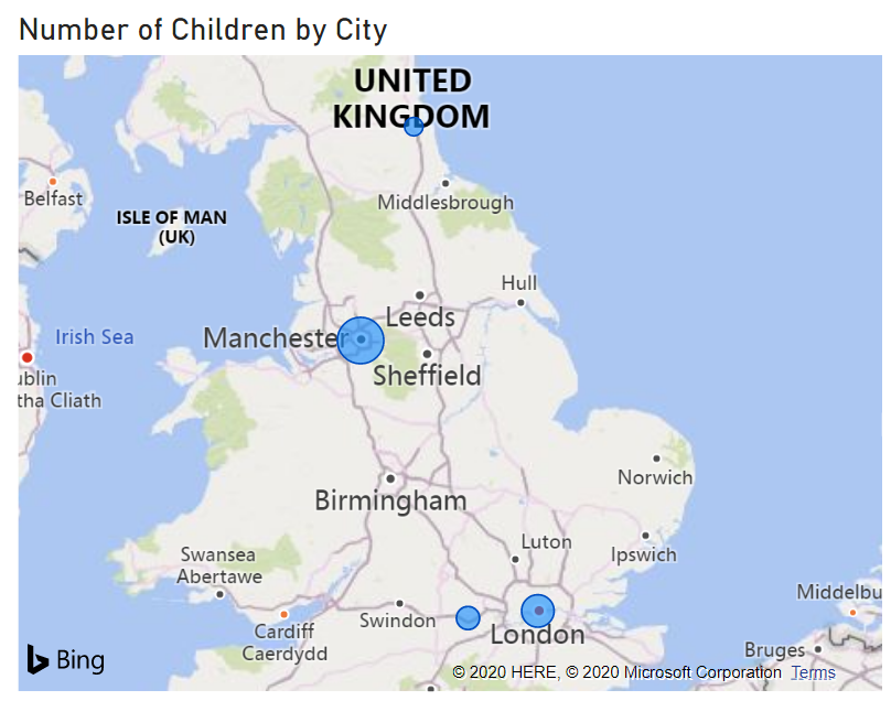
We can get a clear visual idea of the distribution around the country.
Within this, you can also use data categories to further enrich the data. For example, you could specify that the above data relates to cities, and if you had worldwide data you could have a second column which you could categorise as "country". This allows you to present richer map views over the data. Other categories include image and web URLs, which can allow you to display this kind of content within your reports.
Numeric column format
Formatting your numeric columns means that you can display the data in a way which gives the viewer some context. For example, displaying your data as a percentage or a monetary amount means that anyone viewing the report can quickly and easily tell what they're looking at.
Sort order
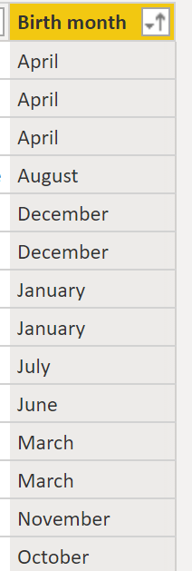
Another thing which can be useful is defining a sort order for your data. This can be especially useful if say, for instance, you have a column which contains the month that someone is born. When you sort by that column it will automatically sort the text in alphabetical order, whereas clearly in the case of months that wouldn't be the expected behaviour.
So instead you can define a sort order based on another column, i.e. if you don't define a sort order:
But if we add an additional column:
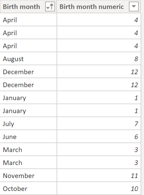
And then define the sort order of the birth month:
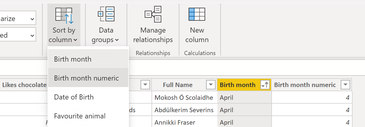
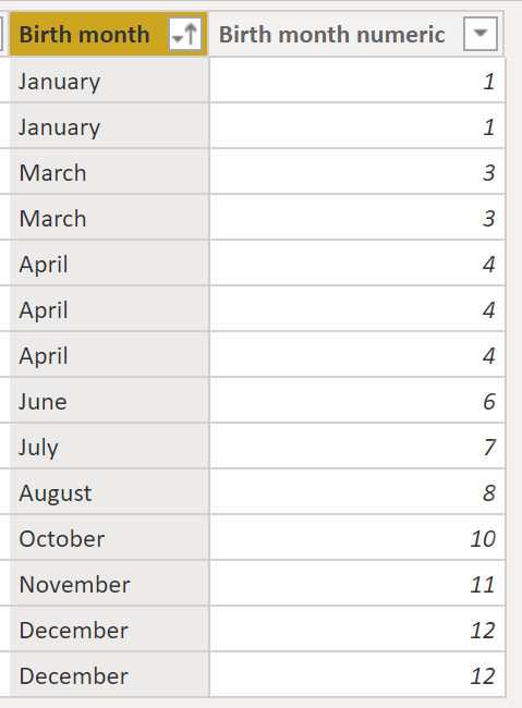
Then when we sort that column, we get the expected behaviour:
Default summarization
Another thing that can be done to improve the model is to add a default summarization to columns. When you display aggregated numeric columns in your reports, the default aggregation method is to sum the values. For instance, if we create a visual which aggregates the number of children by city:
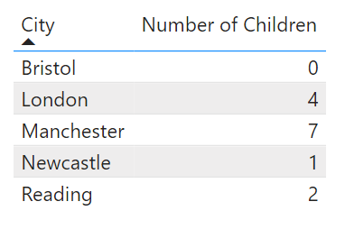
The total for each city is calculated by summing up the children in that city. If we instead wanted this to display the average children in each city, we could update the default summarization for the number of children column:

And we can then see that the table visualisation instead displays the averages:
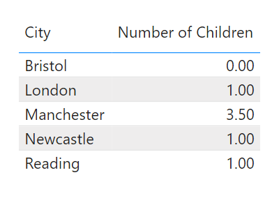
This is especially useful if you have data which it does not make sense to sum – for example ratings.
Using these techniques we have a model which is far more discoverable, and is able to better support the visualisations we need.


