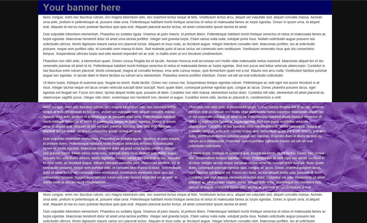
Example of a full-width bleed using Bootstrap 3


In my previous post, I listed some top tips for getting started with bootstrap, and then produced a basic example layout with box-outs, sidebars and bleeds.
One of the most common questions that has come from that post is "how do I achieve a section with a full-width bleed (e.g. for a full-width background), part way down a page?"
Something that looks roughly like this:
We're going to deal with that now. Here's the basic recipe:
No-one said you are limited to only one container on a page
That's the secret sauce.
No-one said you can't put one container inside another
This is the extra slice of cheese.

No-one said you have to put rows and spans in a container
This is the dangerous amount of jalapeno you sneak in under some shredded lettuce.
If you're looking for a full-width background, for example, then you want to nest containers like this to provide a responsive pseudo-fixed-width container (which will appear inline with the rest of your responsive pseudo-fixed-width content), embedded within a full-width responsive background layer.
(Bootstrap3)
<div class="container-fluid">
  <div class="row">
      <div class="col-sm-12">
          <div class="container">
              <div class="row">
                  <div class="col-sm-6">
                      <p>Nunc congue, enim nec faucibus rutrum, orci magna bibendum odio, nec euismod lectus neque at felis. Vestibulum lectus arcu, aliquet vel vulputate sed, aliquet convallis massa. Aenean urna ante, pretium in pellentesque at, posuere vitae urna. Pellentesque habitant morbi tristique senectus et netus et malesuada fames ac turpis egestas. Donec in ipsum urna, id aliquet erat. Aliquam id nisi eu nunc pulvinar faucibus quis quis erat. Aliquam placerat auctor lectus, sit amet consectetur ipsum lacinia sit amet.</p>
                      <p>Duis vulputate bibendum elementum. Phasellus eu sodales ligula. Vivamus at justo mauris, id pretium libero. Pellentesque habitant morbi tristique senectus et netus et malesuada fames ac turpis egestas. Maecenas hendrerit dolor sit amet urna lacinia porttitor. Integer sed gravida turpis. Etiam varius nulla nulla, volutpat porta risus. Nullam sollicitudin augue posuere nisl sollicitudin ultrices. Morbi dignissim mauris varius orci placerat luctus. Aliquam et risus nulla, ac tincidunt augue. Integer interdum convallis nibh. Maecenas porttitor, leo at sollicitudin posuere, neque sem porttitor odio, et convallis sem massa id dolor. Sed molestie justo id lacus luctus vel commodo sem vestibulum. Vestibulum venenatis risus quis dui consectetur tempus. Suspendisse ultricies turpis sed odio laoreet imperdiet vel ac erat. In mattis enim ut orci tincidunt condimentum.</p>
                  </div>
                  <div class="col-sm-6">
                      <p>Phasellus non nibh ante, a elementum quam. Donec cursus fringilla dui et iaculis. Aenean rhoncus erat accumsan orci mollis vitae malesuada metus euismod. Maecenas aliquet leo et dui venenatis pulvinar sit amet id mi. Pellentesque habitant morbi tristique senectus et netus et malesuada fames ac turpis egestas. Sed non purus sed tellus vehicula ullamcorper. Curabitur in nisi faucibus enim rutrum placerat. Morbi consequat, magna at convallis tempus, eros ante cursus neque, quis fermentum quam est a est. Mauris non arcu nulla. Vestibulum facilisis pulvinar augue nec egestas. In iaculis diam in libero facilisis eu rutrum arcu elementum. Phasellus viverra porttitor interdum. Donec vel elit vel erat sollicitudin sollicitudin.</p>
                      <p>Ut libero turpis, tristique et euismod quis, feugiat eu lorem. Nulla facilisi. Donec nec cursus nisi. Suspendisse tempor egestas rutrum. Pellentesque ac velit eget nisl auctor tincidunt in at risus. Integer lacinia neque vel lacus ornare vehicula suscipit dolor suscipit. Nunc quam diam, consequat pulvinar egestas quis, congue ac lacus. Donec pharetra posuere lacus, eget egestas est feugiat vel. Fusce orci dolor, lacinia aliquet mollis quis, posuere at diam. Curabitur non nibh massa, elementum luctus dolor. Curabitur elit odio, elementum sit amet placerat ac, ullamcorper sagittis purus. Integer odio dolor, scelerisque nec hendrerit non, laoreet ut augue. Curabitur lorem odio, lacinia ac placerat in, condimentum a velit.</p>
                  </div>
              </div>
          </div>
      </div>
  </div>
</div>

(Bootstrap2)
<div class="container-fluid">
  <div class="row-fluid">
      <div class="span12">
          <div class="container">
              <div class="row-fluid">
                  <div class="span6">
                      <p>Nunc congue, enim nec faucibus rutrum, orci magna bibendum odio, nec euismod lectus neque at felis. Vestibulum lectus arcu, aliquet vel vulputate sed, aliquet convallis massa. Aenean urna ante, pretium in pellentesque at, posuere vitae urna. Pellentesque habitant morbi tristique senectus et netus et malesuada fames ac turpis egestas. Donec in ipsum urna, id aliquet erat. Aliquam id nisi eu nunc pulvinar faucibus quis quis erat. Aliquam placerat auctor lectus, sit amet consectetur ipsum lacinia sit amet.</p>
                      <p>Duis vulputate bibendum elementum. Phasellus eu sodales ligula. Vivamus at justo mauris, id pretium libero. Pellentesque habitant morbi tristique senectus et netus et malesuada fames ac turpis egestas. Maecenas hendrerit dolor sit amet urna lacinia porttitor. Integer sed gravida turpis. Etiam varius nulla nulla, volutpat porta risus. Nullam sollicitudin augue posuere nisl sollicitudin ultrices. Morbi dignissim mauris varius orci placerat luctus. Aliquam et risus nulla, ac tincidunt augue. Integer interdum convallis nibh. Maecenas porttitor, leo at sollicitudin posuere, neque sem porttitor odio, et convallis sem massa id dolor. Sed molestie justo id lacus luctus vel commodo sem vestibulum. Vestibulum venenatis risus quis dui consectetur tempus. Suspendisse ultricies turpis sed odio laoreet imperdiet vel ac erat. In mattis enim ut orci tincidunt condimentum.</p>
                  </div>
                  <div class="span6">
                      <p>Phasellus non nibh ante, a elementum quam. Donec cursus fringilla dui et iaculis. Aenean rhoncus erat accumsan orci mollis vitae malesuada metus euismod. Maecenas aliquet leo et dui venenatis pulvinar sit amet id mi. Pellentesque habitant morbi tristique senectus et netus et malesuada fames ac turpis egestas. Sed non purus sed tellus vehicula ullamcorper. Curabitur in nisi faucibus enim rutrum placerat. Morbi consequat, magna at convallis tempus, eros ante cursus neque, quis fermentum quam est a est. Mauris non arcu nulla. Vestibulum facilisis pulvinar augue nec egestas. In iaculis diam in libero facilisis eu rutrum arcu elementum. Phasellus viverra porttitor interdum. Donec vel elit vel erat sollicitudin sollicitudin.</p>
                      <p>Ut libero turpis, tristique et euismod quis, feugiat eu lorem. Nulla facilisi. Donec nec cursus nisi. Suspendisse tempor egestas rutrum. Pellentesque ac velit eget nisl auctor tincidunt in at risus. Integer lacinia neque vel lacus ornare vehicula suscipit dolor suscipit. Nunc quam diam, consequat pulvinar egestas quis, congue ac lacus. Donec pharetra posuere lacus, eget egestas est feugiat vel. Fusce orci dolor, lacinia aliquet mollis quis, posuere at diam. Curabitur non nibh massa, elementum luctus dolor. Curabitur elit odio, elementum sit amet placerat ac, ullamcorper sagittis purus. Integer odio dolor, scelerisque nec hendrerit non, laoreet ut augue. Curabitur lorem odio, lacinia ac placerat in, condimentum a velit.</p>
                  </div>
              </div>
          </div>
      </div>
  </div>
</div>
By adding multiple <container> elements, you can mix-and-match full width and pseudo-fixed-width sections, up and down the page.
Of course, in any container, you can also throw in some completely custom HTML - you don't need to follow the grid system at all if that doesn't suit.