Tips for implementing responsive designs using Bootstrap 3


We ran a retrospective of our first few Bootstrap-based HTML5/Javascript projects a few weeks back, and distilled some of the output into these top tips.
1) You don't have to use a container-fluid to make the design responsive
container-fluid is a full-width, smoothly resizing container (e.g. for apps).
container is a pseudo-fixed-width, centred container that steps down in size as the window resizes.
2) Similarly, with Bootstrap 2 you don't have to use a row in a container
You can use row-fluid inside a container to get a 12-column (nestable) fluid grid within a pseudo-fixed-width, centred container that steps down in size as the window resizes. This is the best way to achieve a resizable layout. (You get this behavior by default in Bootstrap 3)
3) You should avoid any use of explicit pixel-based sizes
Definitely no explicit widths or heights, even (especially!) on images. Apply line heights, margins etc. using percentages where possible.
4) Make no use of <br/> or to affect line breaking without testing across all form factors/sizes
Definitely don't use <br/> to create vertical spacing – set up your margins and padding.
5) Always ensure everything is inside a well-understood structure
For Bootstrap 3:
Think <div class='row'><div class='col-sm-x'></div></div>
For Bootstrap 2:
Think <div class='row-fluid'><div class='spanX'></div></div>
6) Think about duplicating and hiding paragraphs on different form factors to alter line-breaks
Use hidden-sm or hidden-xs and visible-sm-inline-block, visible-xs-inline-block (that's hidden-tablet or hidden-phone and visible-tablet, visible-phone on BS2) to alter layout and line-breaks/wrapping on different target devices. Don't forget to proof in every form factor to avoid missing or duplicate elements.
7) Don't forget that if you want something hidden on phones and tablets, you'll have to apply both classes
8) Remember that browsers still load image content, even if the element is not displayed
You will pay for an image download even if the element is display: none;. It is best to use a single image across all resolutions that scales down nicely. That tends to mean avoiding fine lines and text.
9) Most 3^(rd) Party content rotators are broken in various ways
(including jquery.cycle and jshowoff), especially with fluid layouts. Use (and style) the Bootstrap carousel, which copes much better with responsive designs.
10) If you need to break out of the grid, the best way to do this is to use negative margin
Don't forget to also increase the max-width to ensure that the object continues to fill the space (and ensure that the object is large enough, if it is a fixed-dimension thing like an image). For example: .myElement { margin-left: -10%; max-width: 110%; }to break 10% out to the left, and still occupy the full width (if possible).
11) Avoid background images that are really part of the grid/layout
They are not well supported by all browsers, and you have little control over size and positioning – especially in responsive layouts. Instead, put actual img elements into the markup. You can use the media elements in CSS to ensure that you have the right amount of margin at each size for fluid layouts.
12) Designers need to think about the fluidity of the layout
In the past, designers have translated the UX into static Photoshop designs of every page, and then interaction developers have attempted to realise them pixel-perfect across all browsers. In a responsive world, UXs and designers have to think more about the best interaction patterns at different form-factors, and focus on typographical concerns like font sizes, margins, line height and leading... but that's another story.
For an example responsive layout using Bootstrap, see my next post.
Update
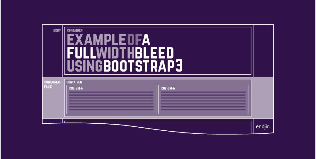
The most common question that keeps coming up is "how do I achieve a full-width bleed part-way down the page?" I've addressed that in this post.
Update 2
Most of these tips are just as applicable to Bootstrap 3. However, I've started a short series on new considerations for Bootstrap 3 over here.