Accessible colour palettes, branded report themes, custom buttons, and cover page design — make your reports beautiful and inclusive.
Design & Accessibility
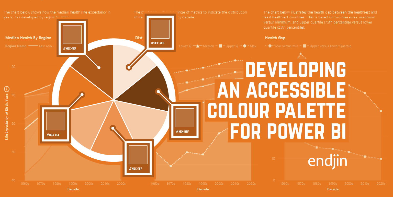
How to develop an accessible colour palette for Power BI
Explore how we developed an accessible color palette for Power BI reports, considering color vision deficiency and data visualization.
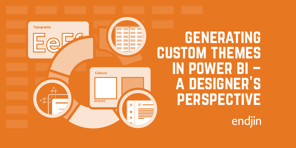
Generating custom themes in Power BI – A designer's perspective
Explore custom Power BI themes and learn tips for styling reports, pushing beyond your comfort zone for enhanced data visualization.

How to Build a Branded Power BI Report Theme
Explore translating a company's brand into Power BI reports and extending their visual identity to include the Power BI platform.
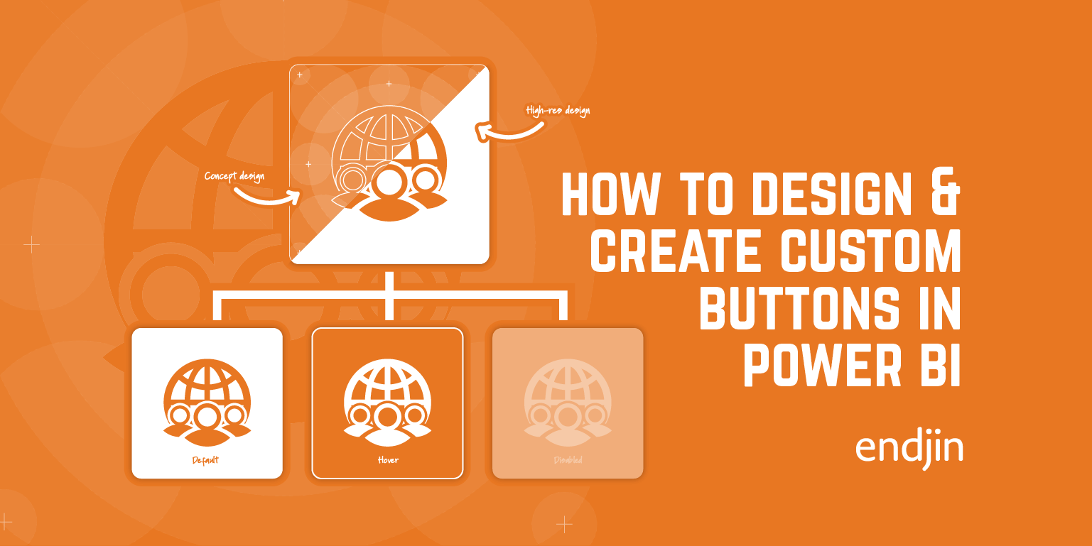
How to Create Custom Buttons in Power BI
Explore a step-by-step guide on designing custom buttons in Power BI, covering shape, form, icons, states, actions, and enhancing report design & UI.
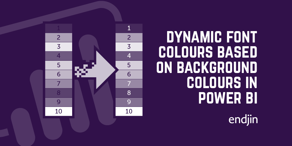
How to dynamically choose the correct font colour based on a background colour in Power BI tables.
Boost Power BI report readability with dynamic font colors for diverse backgrounds, ensuring clear text display and enhanced accessibility.
How to enable data teams with the design assets required for impactful data storytelling in Power BI
In this post we will talk through how to expand on a data team's creative skillset, without access to specialist photo editing software such as Photoshop or Illustrator.