Turn data into narratives that drive action. Learn how to design reports that guide decisions through effective visual storytelling.
Data Storytelling
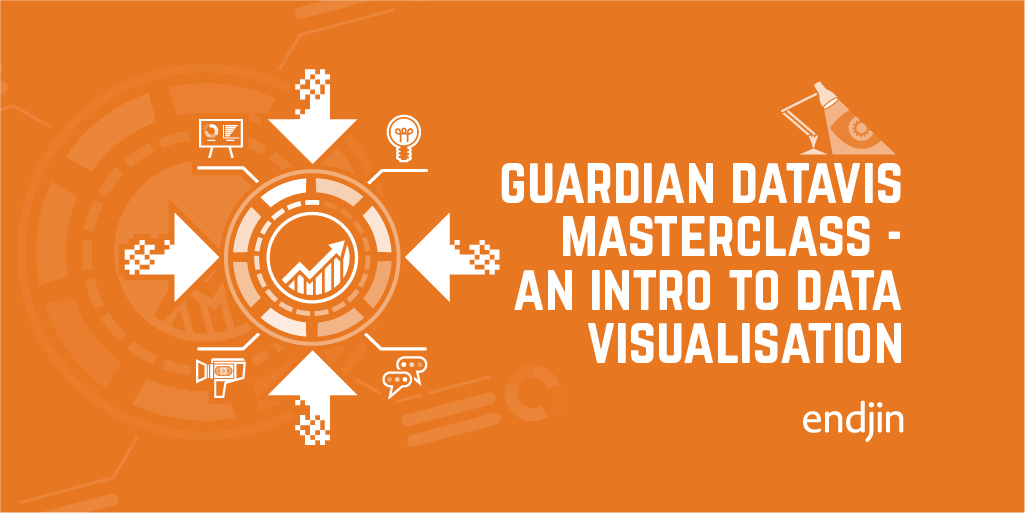
Guardian Masterclass - An introduction to Data Visualisation
A few years ago, I attended a Guardian 1-day Masterclass - Introduction to Data Visualisation. What I did not know then was that it would have a profound effect on how I view design. This blog is a recap of that day and reference points to consider when designing and creating graphics for data visualisation.

Power BI Images That Pop: A Guide to Intuitive, Easy-to-Maintain Reports
Explore integrating icons, pictograms and images into Power BI in the optimal way to enhance the user experience and minimise effort required to build and maintain reports.
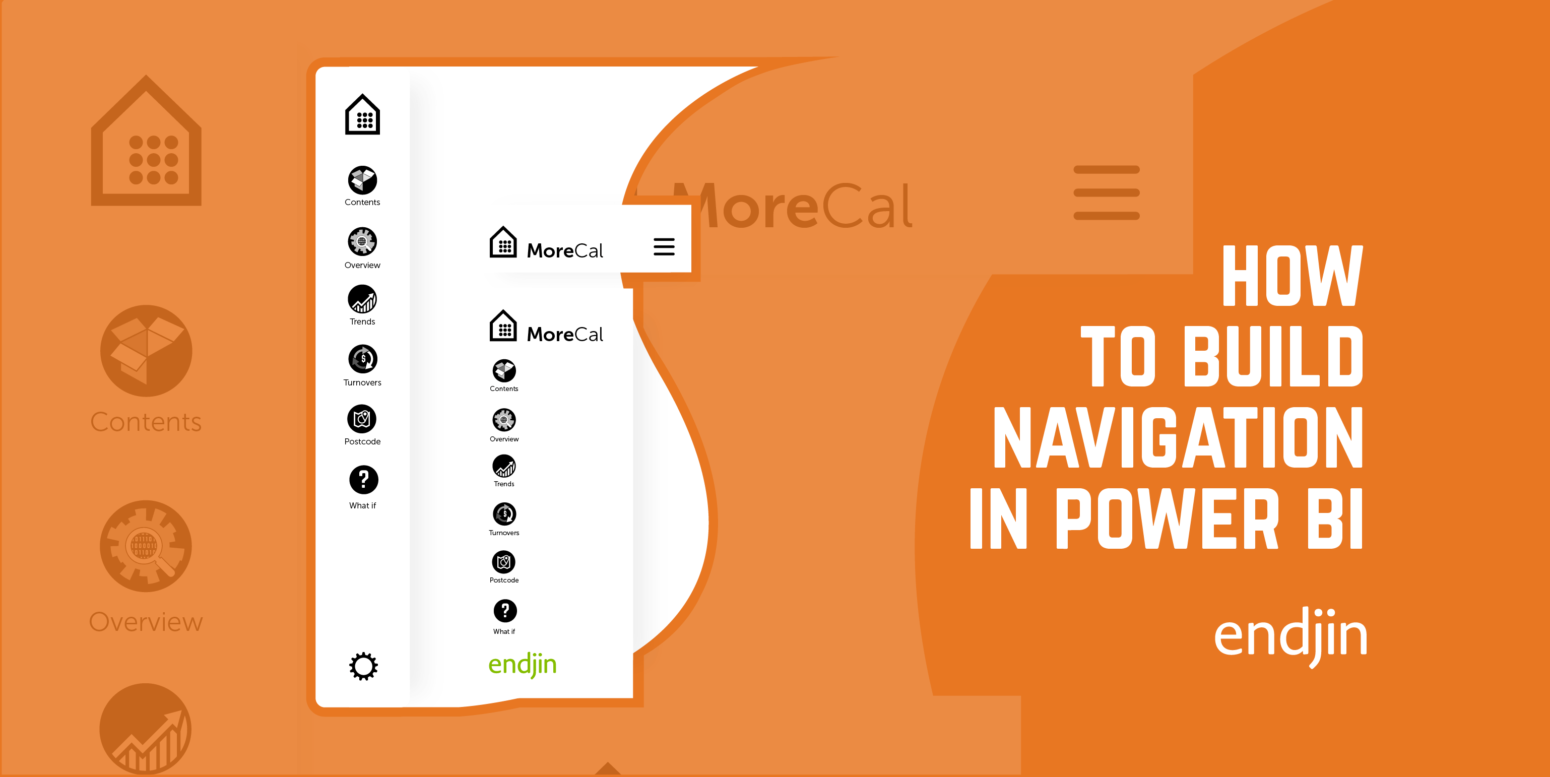
How to Build Navigation into Power BI
Explore a step-by-step guide on designing a side nav in Power BI, covering form, icons, states, actions, with a view to enhancing report design & UI.
How to Build Mobile Navigation in Power BI
This is follow guide to designing a mobile navigation in Power BI, covering form, icons, states, actions, with a view to enhancing report design & UI.
Learning from Disaster - A Creative Walkthrough of the Titanic Power BI Report
In Paul Waller's final, and posthumously published blog post, he takes you through a creative walk-through of the Titanic Power BI Report he created with Barry Smart.