
Power BI
We help organisations design, build, and optimise Power BI solutions that turn data into decisions. With Microsoft MVPs, a weekly newsletter reaching thousands, and years of hands-on delivery — we're ready when you are.
What's your Power BI maturity?Strategy & Assessment
Start with a clear picture of where you are and where you need to be. Our Power BI Maturity Scorecard, skills assessments, and blueprints de-risk your project and accelerate time to value.
Design &
Build
From data storytelling and accessible report design to semantic data modelling and advanced DAX — we design and build Power BI solutions that deliver actionable insights at scale.
Enablement & Operations
Sustainable success means empowering your team. We provide bespoke training, weekly mentoring, and DataOps practices to keep your Power BI platform reliable and your people confident.
What we do
From weekly Office Hours to bring a fresh perspective on strategy, a big architectural decision, or an intractable technical problem, to delivery squads working to a deadline.
Blueprints
Data Storytelling
Design & Accessibility
Data Modelling
DAX
DataOps
Training
Mentoring
Skills Assessment
Power BI Talks
We cover lots of different topics around Power BI, from design & accessiblity, to tours of demo reports.
Watch on YouTubeHouse Price Analysis -- Unlocking England and Wales Housing Insights
30 Years, 30 Million Data Points. In this report we have loaded 30 years of house price data for England and Wales.
We invite you to navigate through our streamlined dashboard, where each carefully designed page focuses on a specific theme to deliver clear, actionable insights. Whether you're a potential buyer, seller, property investor, a house builder, mortgage provider, home insurance provider or market analyst, our simple interface will be intuitive to use.
Global Brand Insights: 20 Years of Financial Trends
In this report we have chosen 25 global brands across the categories of tech, food & drink, entertainment, automotive, and financial services.
We have then ingested 20 years of financial data for each brand with the objective of using Power BI to generate some descriptive analytics over this data. You can clearly see the market movers by observing stock prices over the last 20 years.
There are also global insights, such as the impact of the financial crisis in 2008 and the invasion of Ukraine in 2021. You can also observe the evolving markets and the domination of the big tech companies with their market capitalization that dwarfs many of the other brands.
The World Bank World Health & Wealth Report
We've created a report that uses open data published by the World Bank to explore global trends in wealth & health.
We use this report to demonstrate design and accessiblity recommended practices. Colour Vision Deficiency (CVD) affects 1 in 12 males, and 1 in 200 females, which means accessibility should be a key requirement in any Power BI report or data visualisation.
Titanic Disaster Incident Report
We showcased this Power BI report during talks at SQLBits 2024. It's based on open data sources available from Kaggle.
The report is designed to mimic an interactive museum exhibit. Discover insights on demographics, survival rates, and how to create a visually engaging and informative data story.
Power BI Learning Paths
With 40+ in-depth blog posts, our team shares hard-won expertise on every aspect of Power BI — from DAX fundamentals to enterprise deployment.
All Power BI postsDAX Mastery
Design & Accessibility
Data Storytelling
DataOps & Testing
Modern Development
Power BI + Fabric
Latest Power BI blogs

Learning from Disaster - A Creative Walkthrough of the Titanic Power BI Report
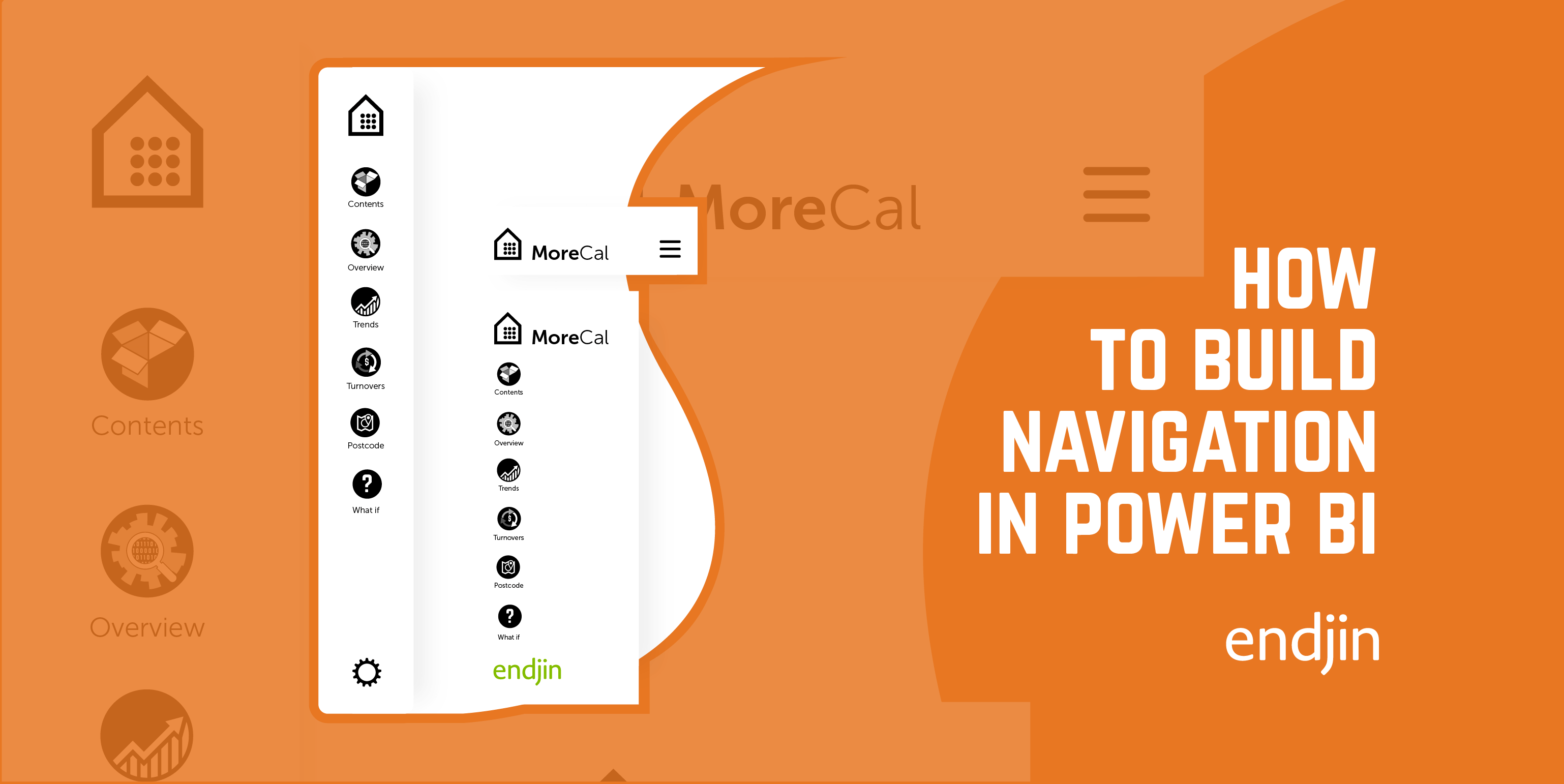
How to Build Mobile Navigation in Power BI
Encoding categorical data for Power BI: Using label encoded data vs one-hot encoded data in Power BI
Encoding categorical data for Power BI: Label encoding vs one-hot encoding - which encoding technique to use?
Power BI Images That Pop: A Guide to Intuitive, Easy-to-Maintain Reports
Trusted by data-driven organisations
From SMEs to global enterprises, we help organisations harness the full potential of their data.
But don’t just take our word for it.
We pride ourselves on our customer relationships. Here's what they had to say about us.


